The Atlas Building
The Client & Challenge
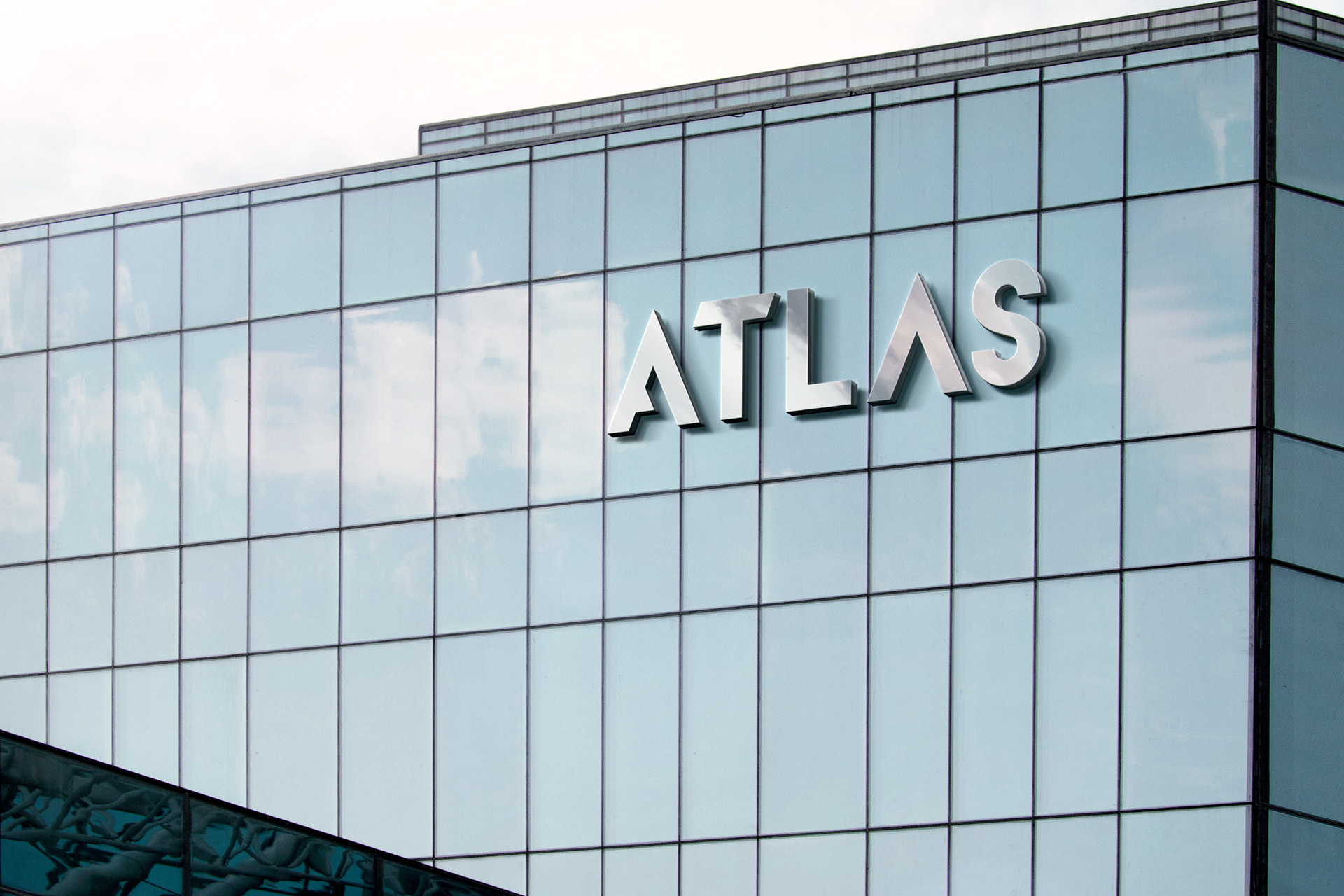
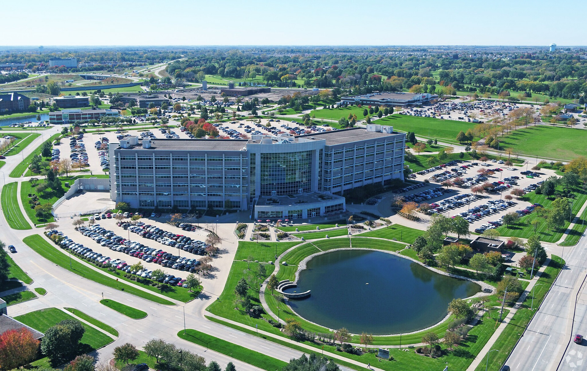
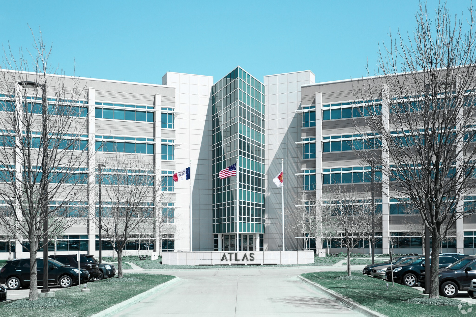
Formerly an iconic Wells Fargo facility, the Atlas campus spans multiple acres and accommodates diverse tenant needs. The objective was to strip away decades of single-brand association and construct a cohesive, architectural brand identity from the ground up. This required an identity that speaks to scale, high-end design, and long-term versatility, seamlessly integrating the physical environment with a compelling visual narrative to attract modern businesses and activate the entire property.

The Challenge:
Entering the Evolve Phase
Client Goals
- Establish a Statement Brand: Position the campus as a premium, architectural landmark within West Des Moines.
- Campus-Wide Synergy: Deliver a unified visual system that scales across the massive physical footprint, harmonizing the diverse tenant spaces.
- Amenity Integration: Seamlessly fold on-site amenities—such as the Atlas Cafe—into the primary overarching identity.
Problems & Solutions

The site was heavily branded as a single-tenant Wells Fargo campus, making it difficult to attract dynamic multi-tenant interest. The existing visual cues and spatial flow reflected a closed corporate structure, alienating prospective companies looking for a modern, collaborative environment.

We partnered with WB Realty to re-concept the property from the ground up, establishing the "Atlas" name. This foundational shift completely dismantled the legacy identity, replacing it with a commanding, forward-looking brand that signals versatility and high-end appeal to a broad spectrum of tenants.
Standard corporate branding risked feeling disconnected from the building’s expansive physical footprint, distinct materials, and bold architectural lines. Applying a generic, flat visual system would undermine the grandeur of the physical space.
We anchored the visual identity directly in the building's structural essence. By deriving logo forms, color palettes, and materiality directly from the site’s unique architectural lines and physical surround, we ensured the brand felt natively integrated into the environment.
Navigating a massive multi-tenant campus required extensive environmental signage, but implementing this risked cluttering the premium architectural aesthetic with overwhelming directional text and disparate tenant plaques.
We designed a holistic, highly disciplined signage ecosystem. From the high-impact exterior monuments to the interior directionals and Atlas Café branding, the unified system balances intuitive wayfinding with a high-end, minimalist architectural appeal.
Reshaping the Brand
BRAND IDENTITY
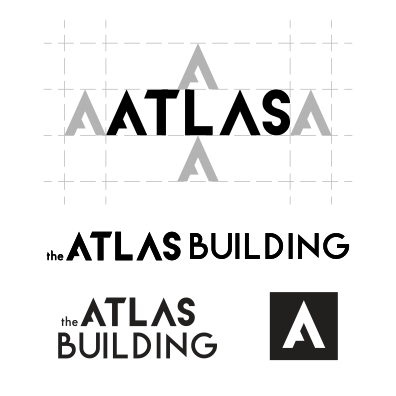
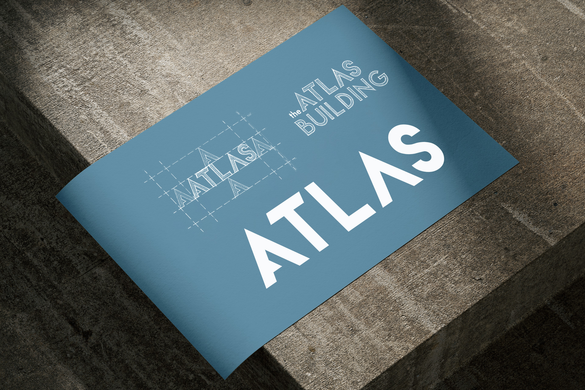
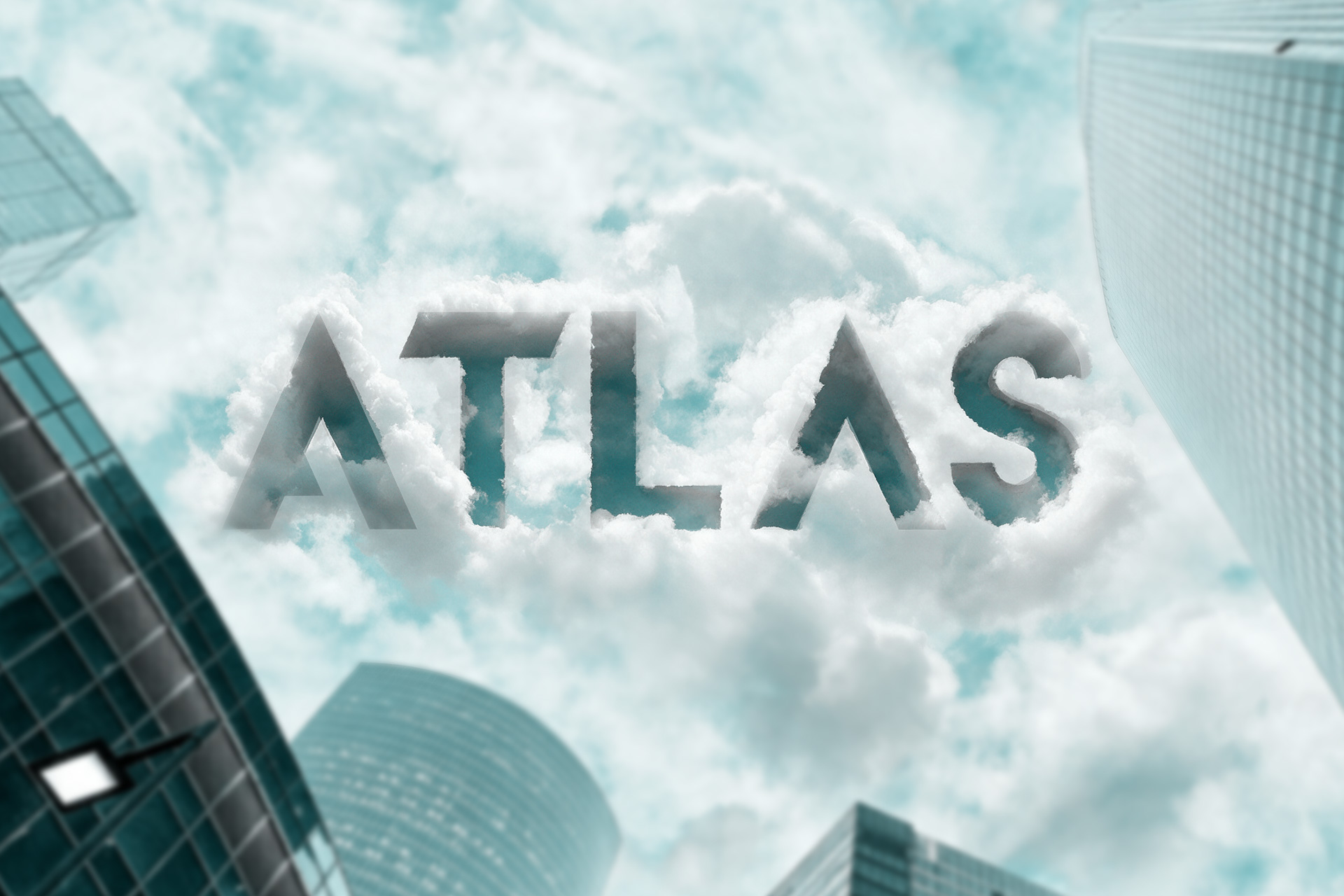
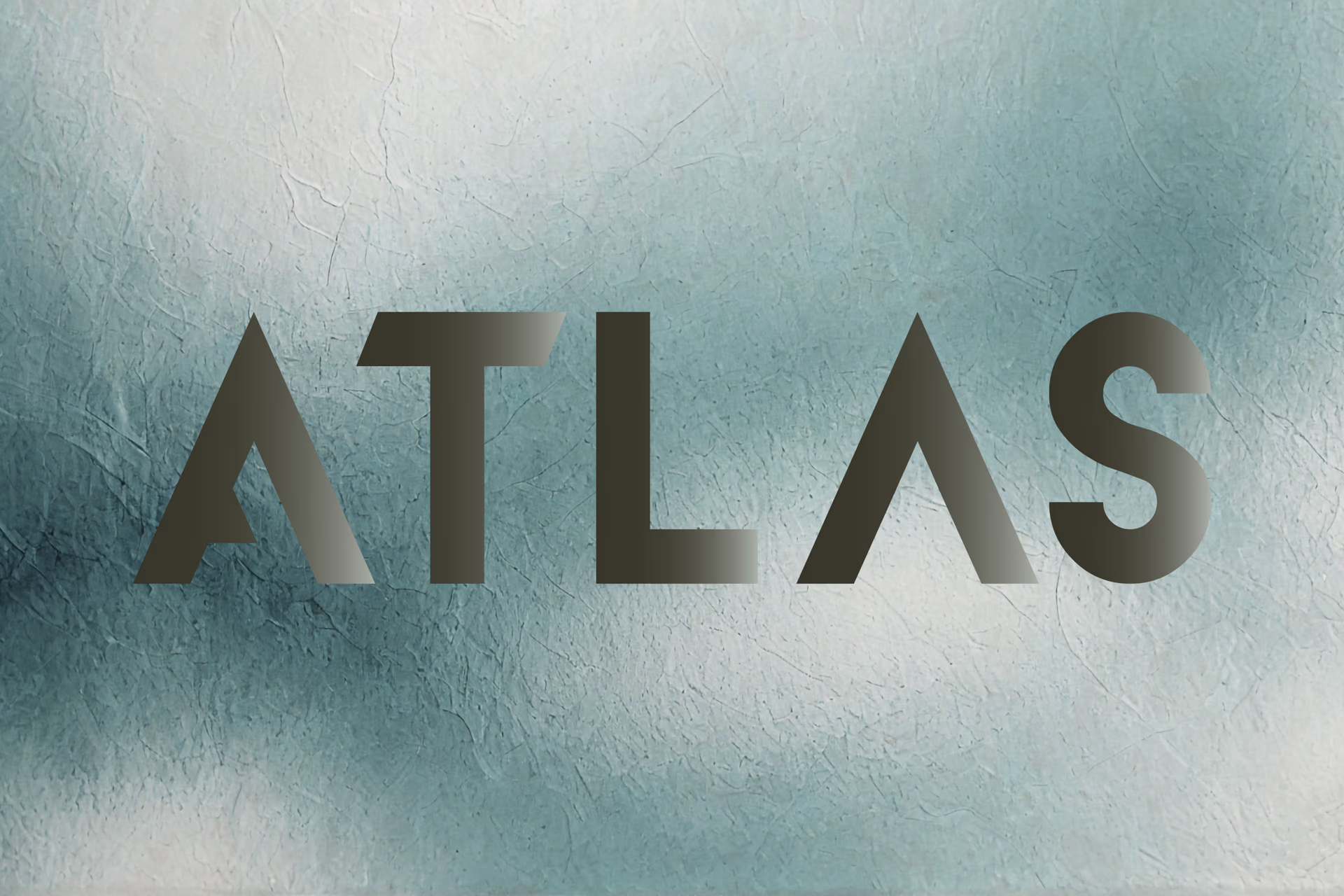
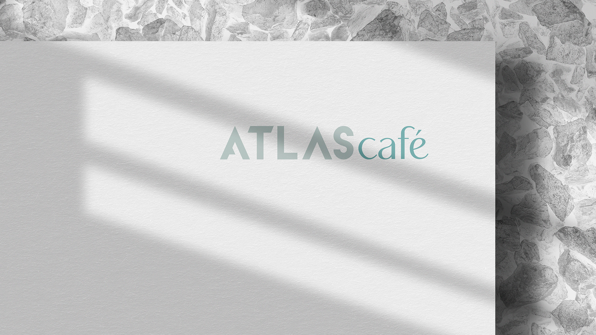
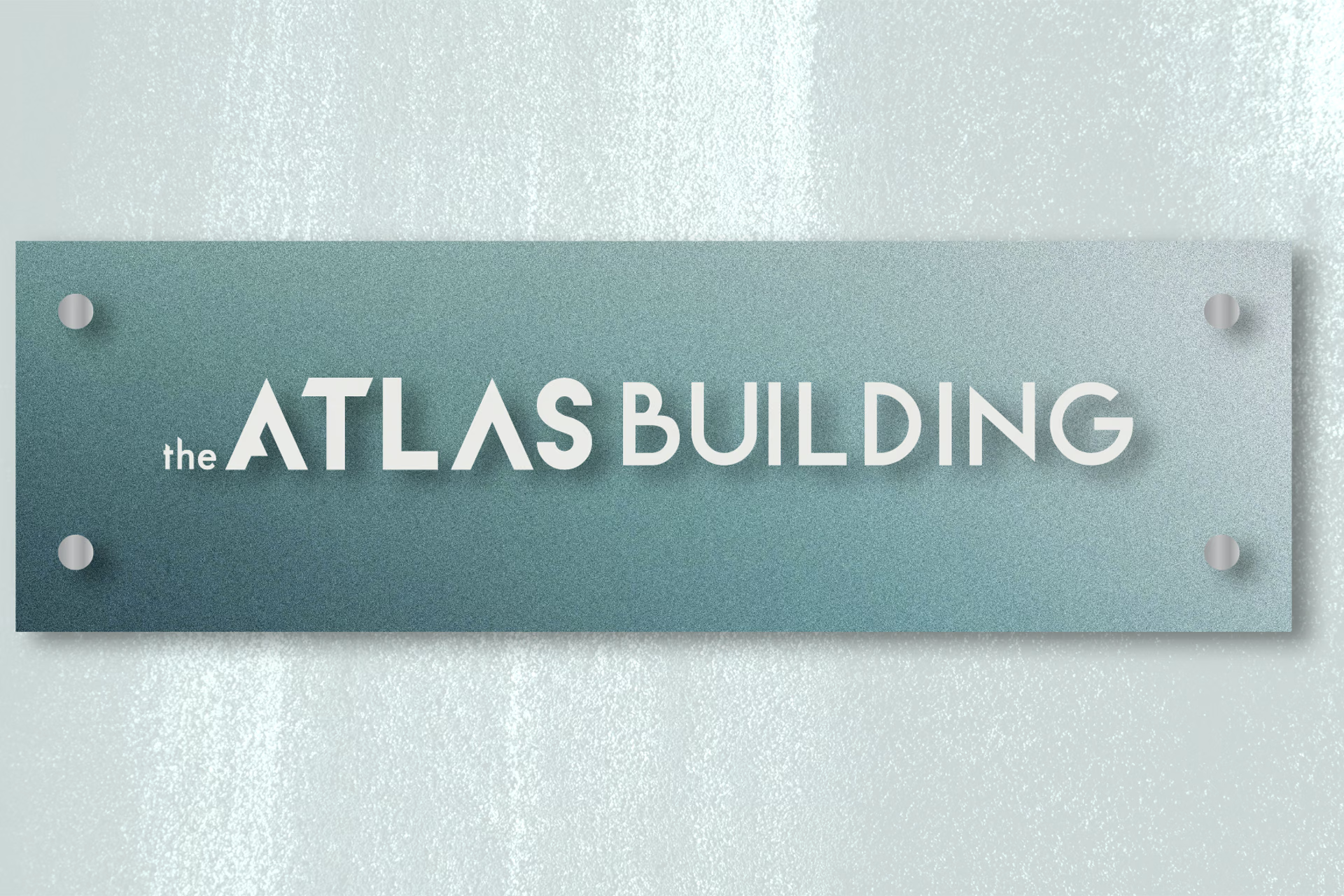
The refined Atlas logo features a modern, geometric 'A' brand mark designed to echo the sweeping architectural lines of the building itself. The mark suite includes versatile variations — from primary horizontal logos to stacked wordmarks and isolated icon badges — ensuring perfect legibility across both massive environmental applications and digital platforms.
COLOR
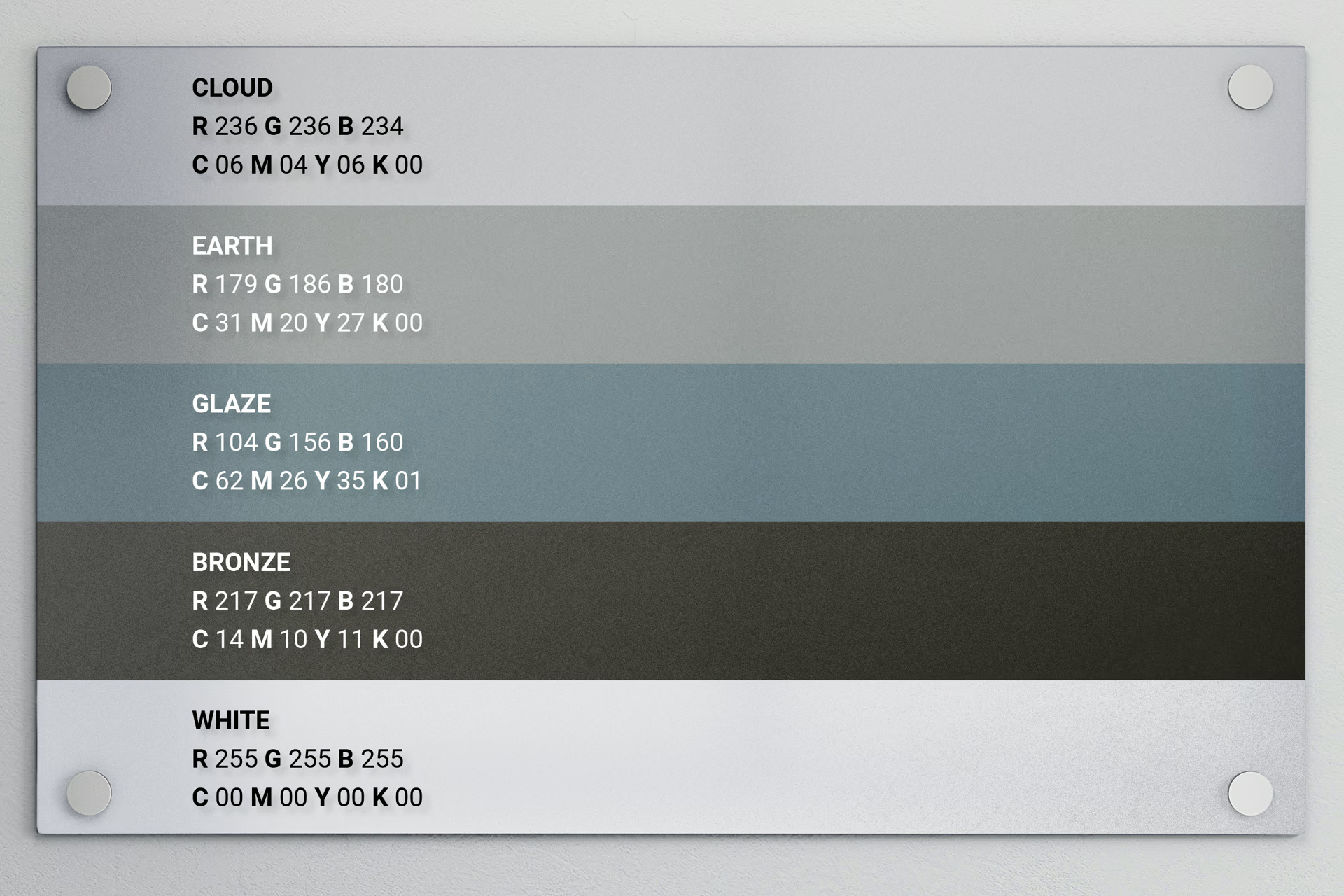
The color palette is drawn directly from the surrounding campus environment and the building's structural tones. It features a sophisticated mix of deep architectural blues, muted concrete grays, and warm, approachable neutrals, creating a balanced, modern aesthetic.
TYPOGRAPHY
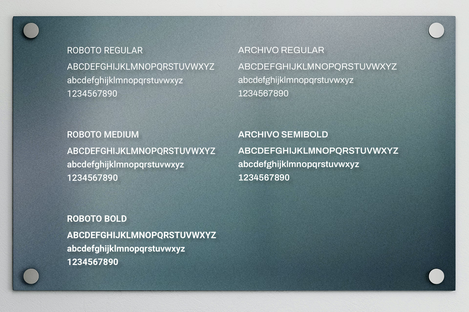
We selected clean, structured sans-serif type families designed for maximum legibility and architectural alignment. The typography performs flawlessly across high-visibility exterior signage and detailed printed guidelines, maintaining a premium, cohesive voice.
MATERIALS
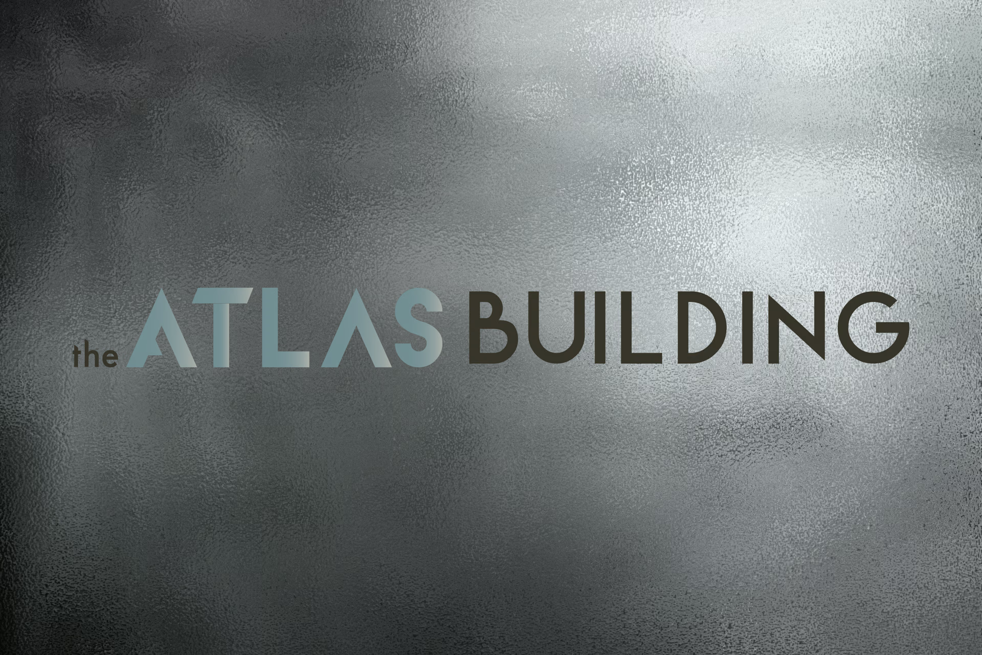
Tactile finishes paired with existing structural elements to ensure signage feels like a seamless architectural extension.

PRINT
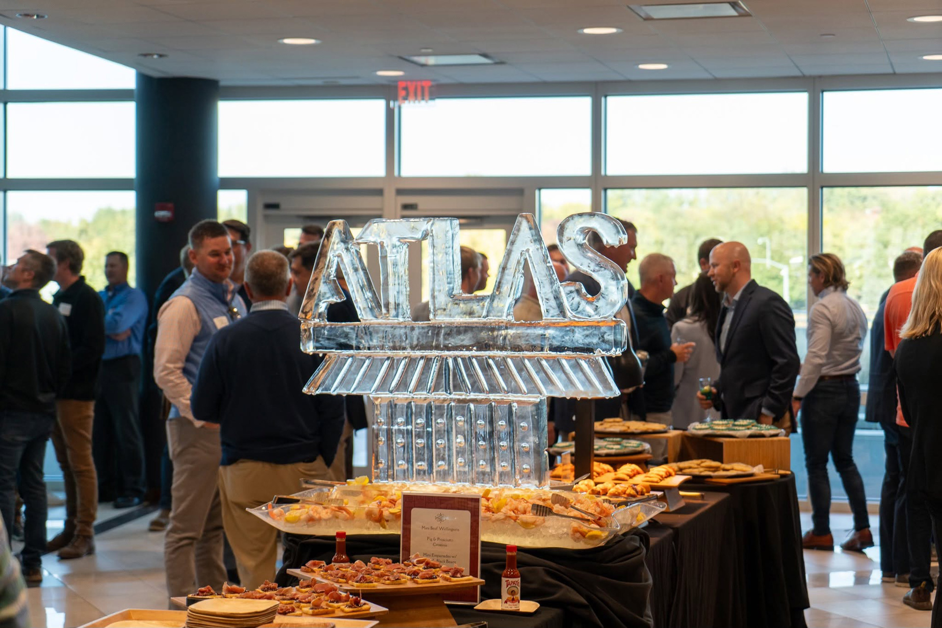
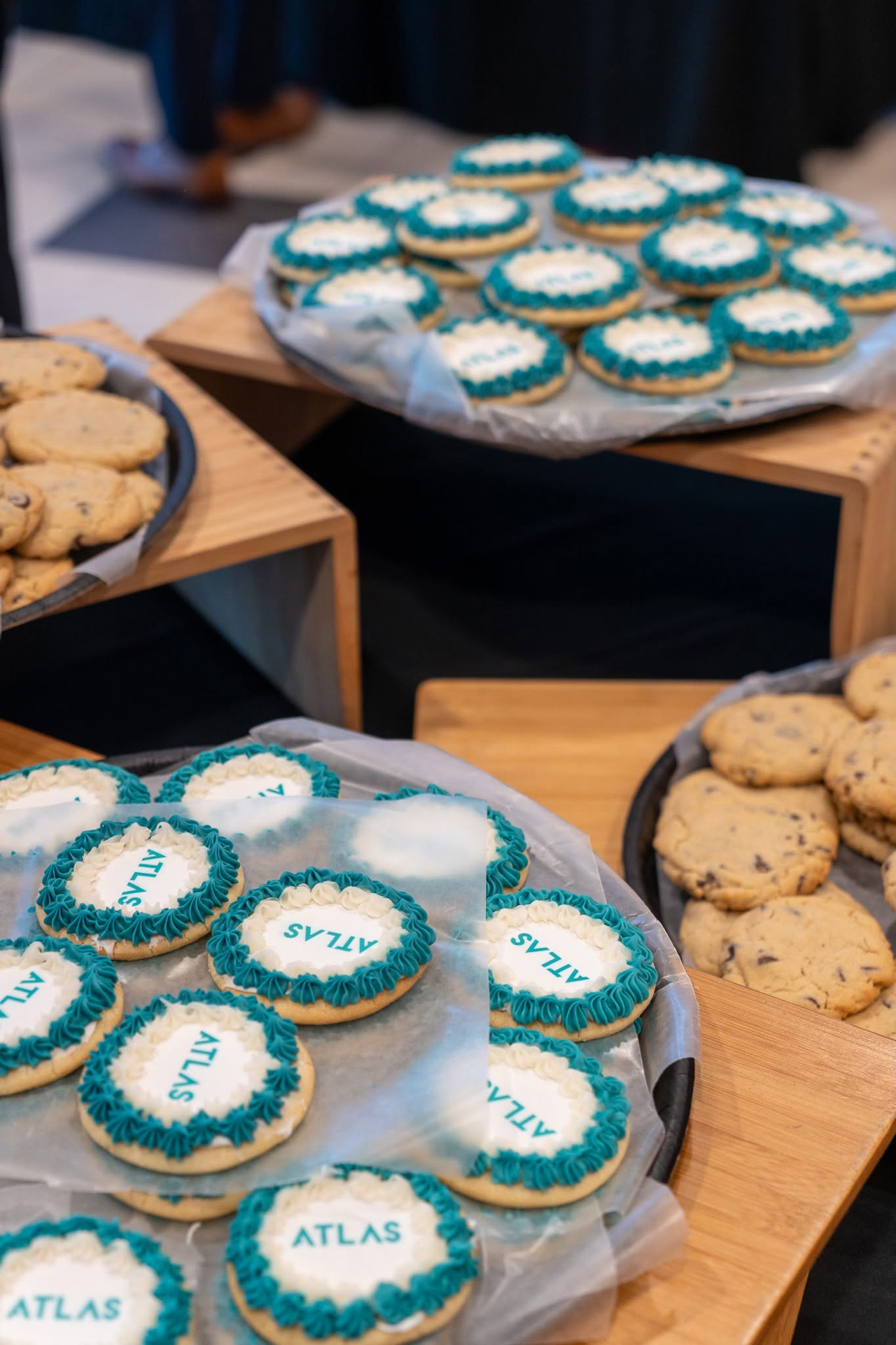
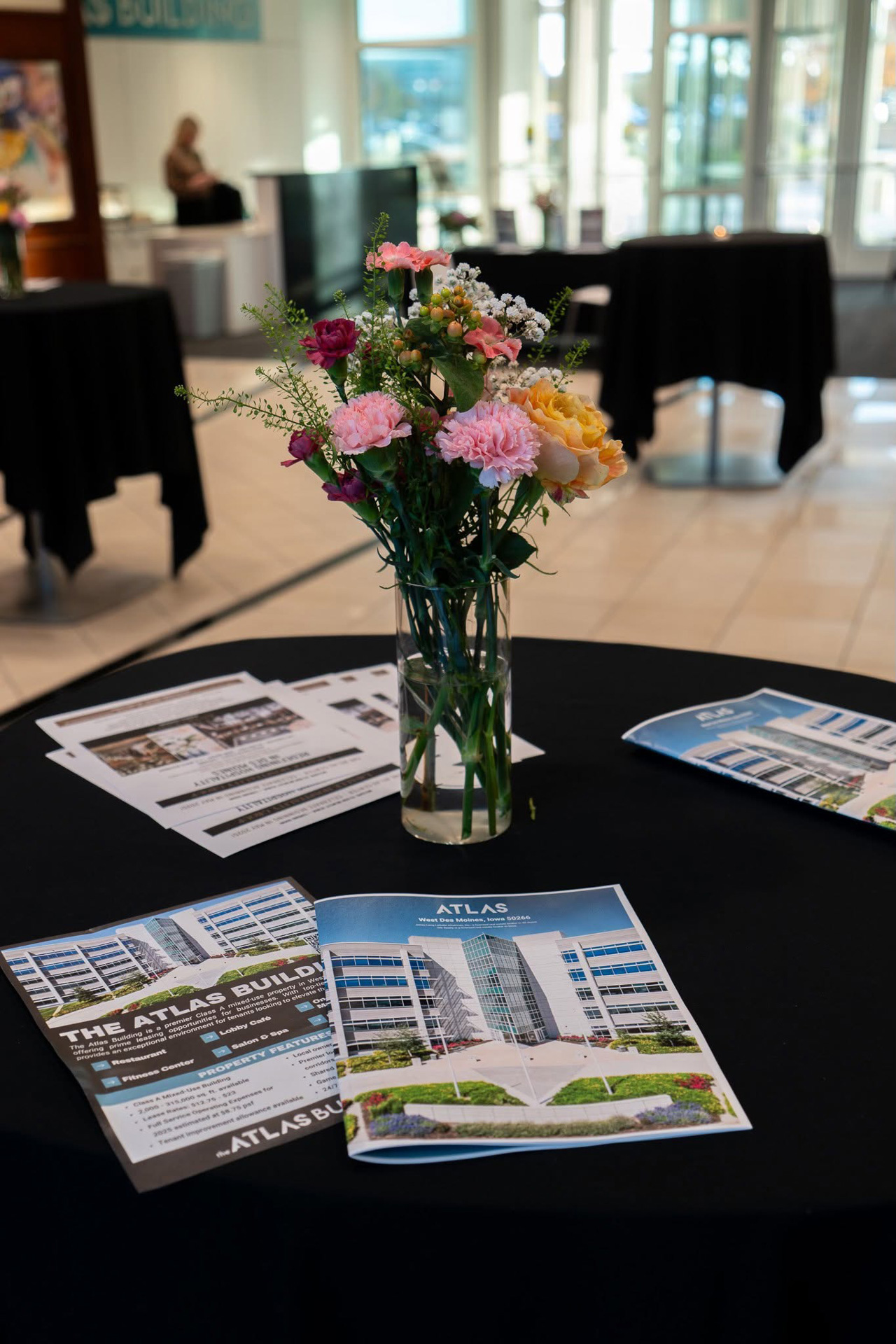
Comprehensive brand guidelines, launch event collateral, and promotional packaging developed to activate the brand identity for tenants and visitors.

BRAND APPLICATION: CAFE
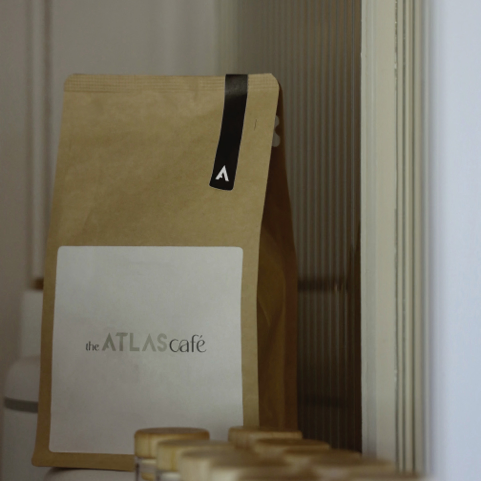
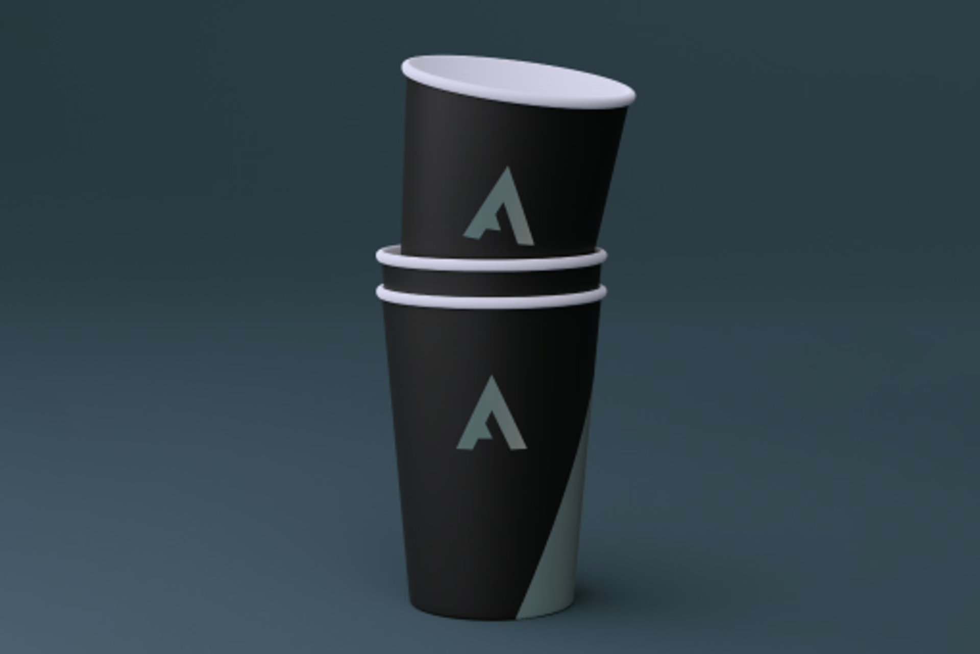
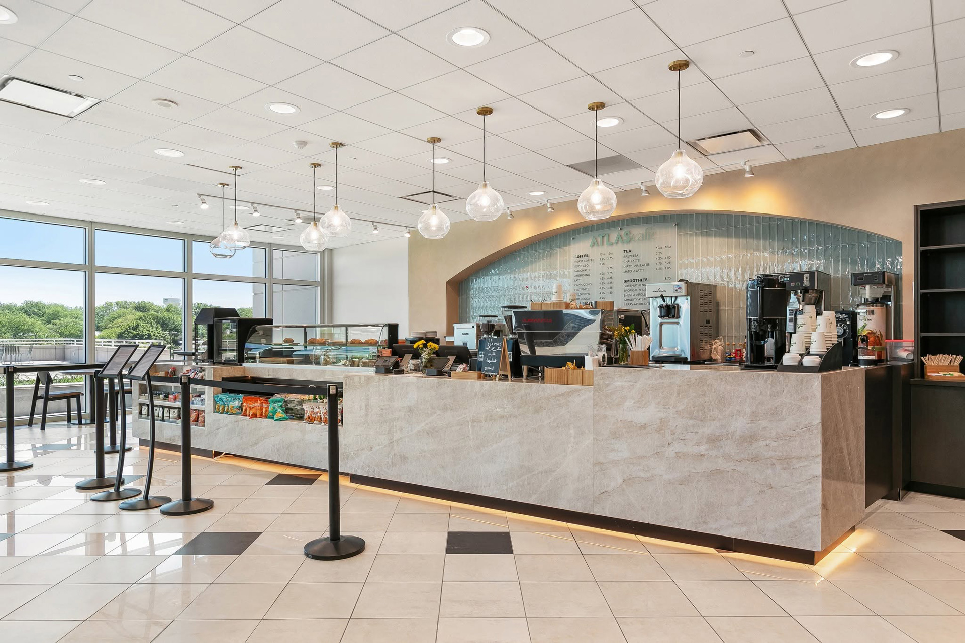
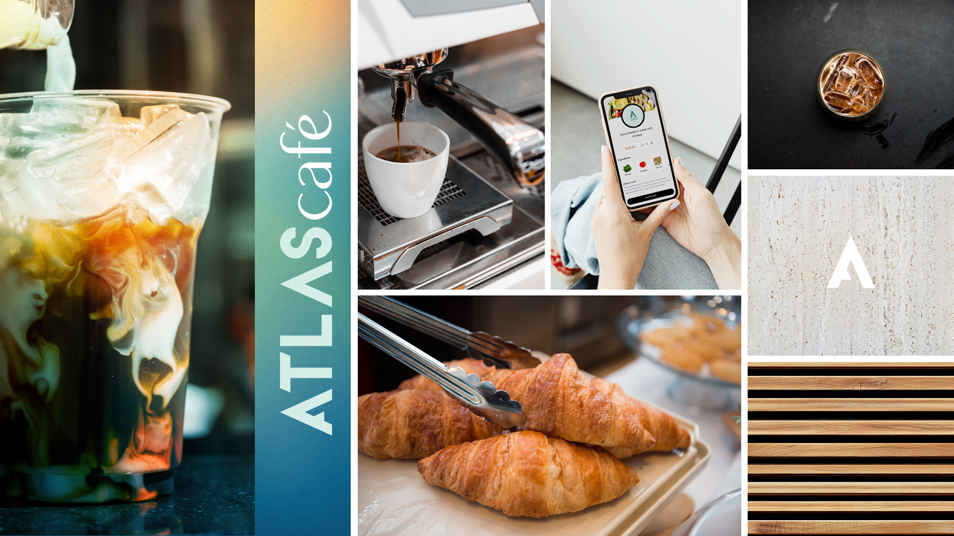
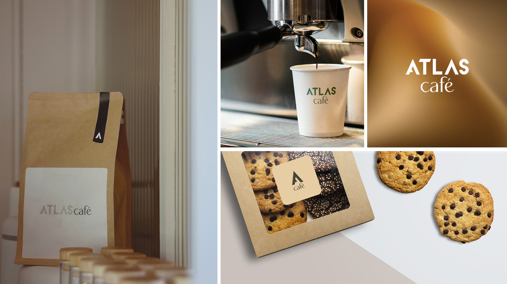
We created a dedicated sub-identity for the Atlas Café, deploying branded packaging, coffee cups, bakery boxes, and interior touchpoints. This cohesive sub-brand establishes an inviting hospitality anchor that integrates naturally into the primary campus experience.
CAFE a dedicated sub-identity for Atlas Café, creating an inviting hospitality anchor that integrates naturally into the campus experience.
Café & Interior Touchpoints
The exterior system features dedicated entrance signage for the Atlas Café. Moving inside, the brand experience continues immediately upon entering the building, welcoming visitors with high-quality photo print interior signage that sets a premium tone for the space.
Custom Signage
Exterior Monument & Navigational Signage
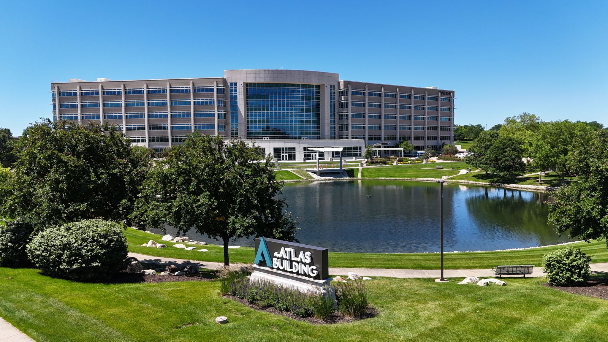
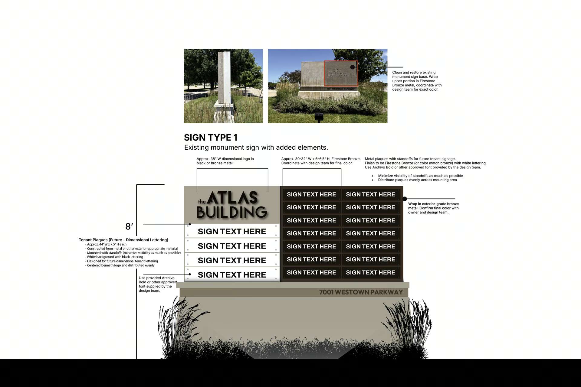
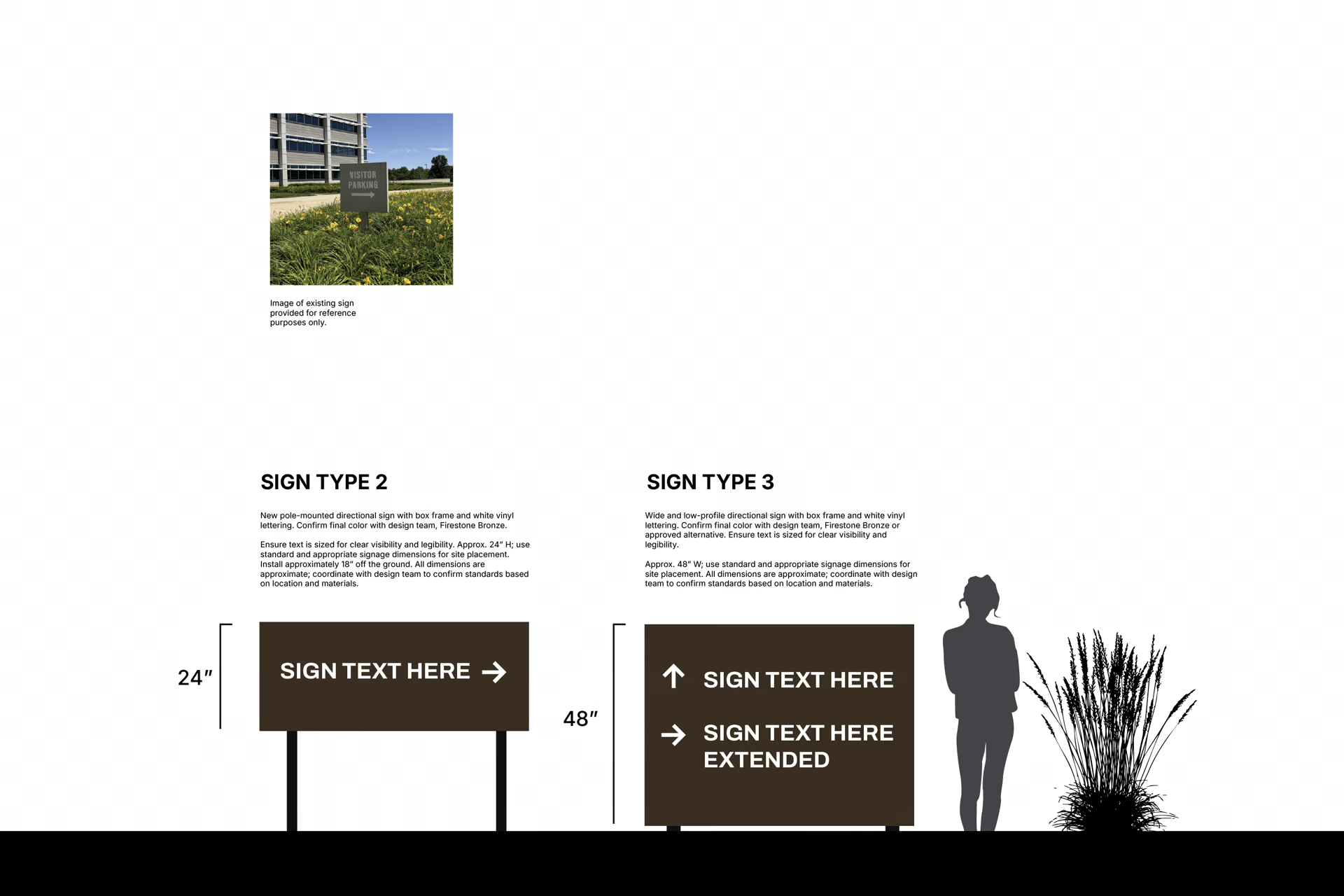
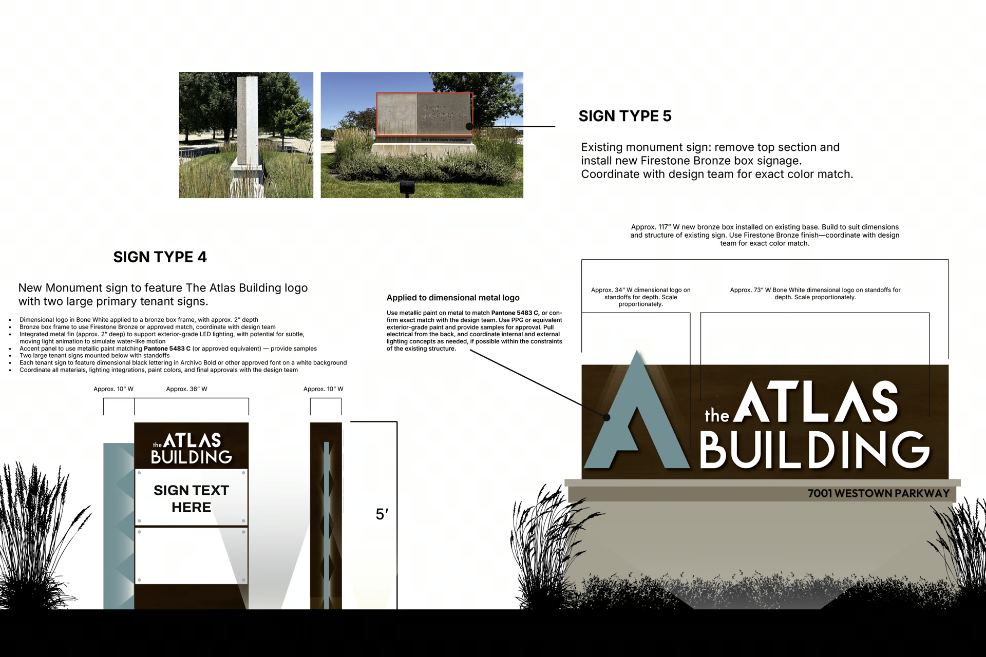
Reviewed city codes and worked in tandem with the client to ensure exterior applications aligned with local standards as they coordinated with the city. To provide a cost-effective approach, we repurposed existing monument bases and legacy tenant signage, designing modern architectural structures to fit over the old footprints. Alongside these retrofitted elements, we designed new monument signs and clear navigational entrance graphics to direct campus traffic.
Production & Design Coordination
To support the execution process, we provided renderings, elevation sketches, material specifications, and dimensional schematics to both the ownership team and the sign fabricators. By managing the design direction, Pantone color matching, and production coordination, we helped ensure the final structures are on-brand and recognizable to drive-by traffic, providing clear visibility for the tenants located within the Atlas building.
Café & Interior Touchpoints
The exterior system features dedicated entrance signage for the Atlas Café. Moving inside, the brand experience continues immediately upon entering the building, welcoming visitors with high-quality photo print interior signage that sets a premium tone for the space.
Modernizing An Existing Landmark
Transforming the Narrative
Shedding the legacy of a monolithic, single-tenant corporate headquarters required a complete conceptual overhaul. By stripping away decades of previous association and building the "Atlas" identity from the ground up, we successfully repositioned the campus as a vibrant, highly sought-after destination.
A property reborn for dynamic, multi-tenant growth.
Architectural Synergy
Rather than applying a disconnected corporate brand to the massive physical footprint, we drew inspiration directly from the building’s structural lines, materials, and surrounding environment. The resulting visual system scales flawlessly from expansive exterior monuments down to tactile interior finishes.
A visual identity natively integrated with its environment.
Strategic Wayfinding
Navigating a multi-acre campus was made intuitive and visually striking through a highly disciplined signage program. By creatively retrofitting existing legacy monument bases and seamlessly coordinating production, we delivered a premium, code-compliant navigation system that maximized both budget and brand impact.
Clear navigation meeting premium, street-level visibility.
The Atlas Legacy
By deeply aligning the new visual identity with the site's sweeping architecture, we transformed the Atlas building from a closed corporate relic into a premier statement property in West Des Moines. The comprehensive branding and strategic signage program not only solved immediate multi-tenant wayfinding challenges but also established a powerful, enduring brand presence. From the commanding exterior monuments to the welcoming interior touchpoints of the Atlas Cafe, the property now stands as a cohesive, modern landmark ready to attract and retain top-tier businesses for years to come.