The Client & Challenge
Marlow 35 is a new Hubbell Realty residential community in Ankeny, Iowa, bringing together townhomes, multifamily residences, shared amenities, and outdoor spaces.
Our work started with establishing an identity for the new community, then carrying that brand into the physical property and the visuals used to introduce Marlow 35 before the development was complete.
Building a Brand Before the Community is Built
Marlow 35 needed an identity that could introduce the development before residents could experience it for themselves. The brand needed to work across marketing, signage, and the property itself while giving Hubbell’s internal team a clear visual direction to carry forward.
Problems & Solutions

A New Community Without an Identity
Marlow 35 needed a distinct visual identity that could establish the property within Hubbell’s residential portfolio.

A Complete Brand Foundation
We created the logo, icon, typography, color palette, imagery, and supporting visual elements, giving the community a recognizable identity and Hubbell’s marketing team a clear system to work from.
Plans That Were Difficult to Visualize
Site plans and architectural drawings showed what was being built, but not how the full community would come together.
Bringing the Site Plan to Life
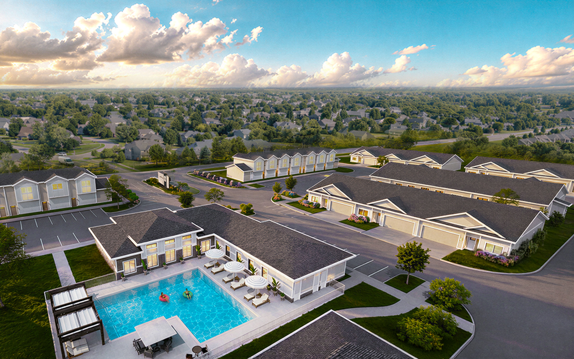
We translated the plans into a full community visualization, showing buildings, streets, landscaping, amenities, and entry points together in one cohesive view.
Showing More Than the Buildings
Architectural renderings alone could not communicate the activity and experience of living within the community.
Lifestyle-Focused Rendering
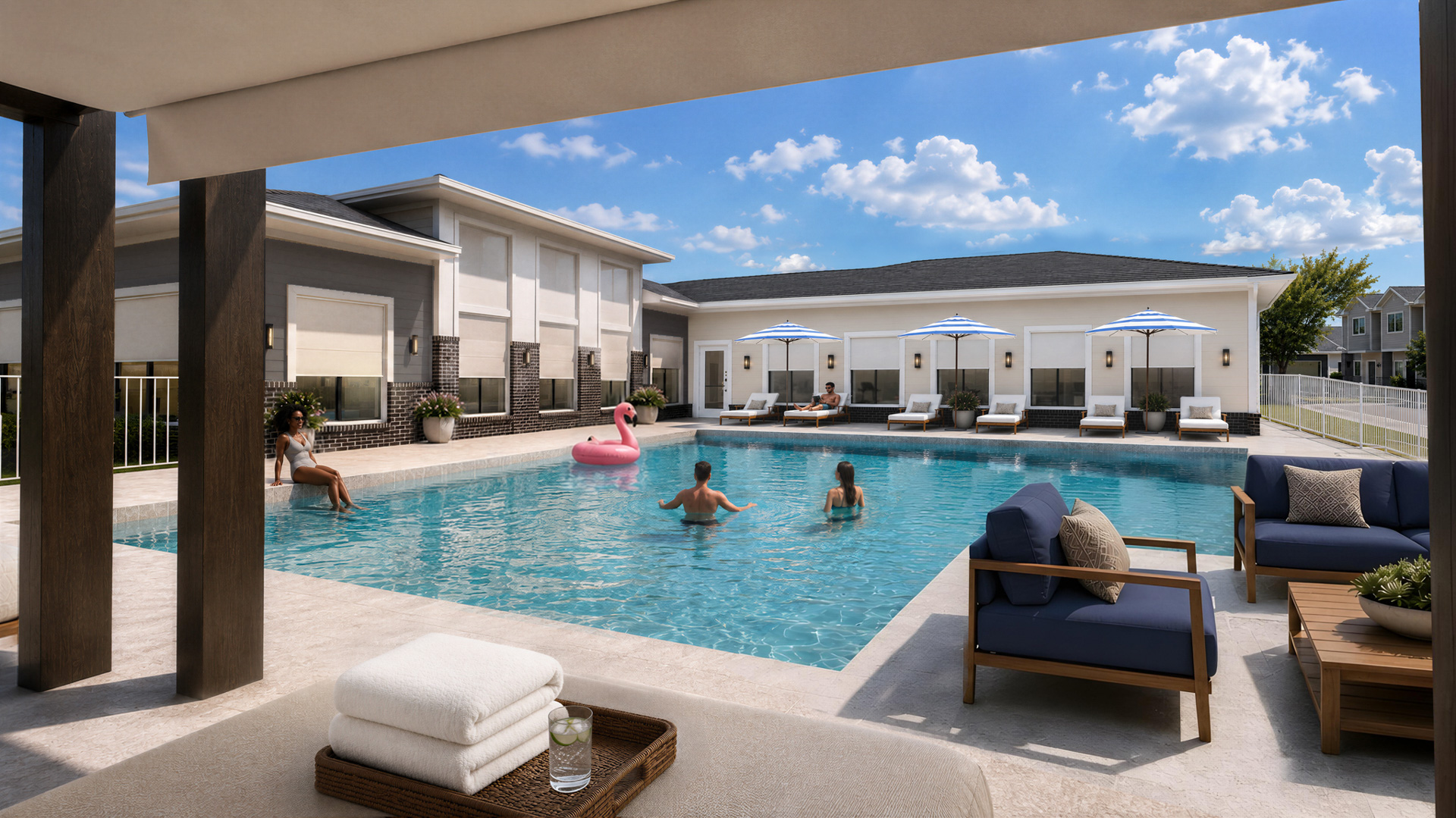
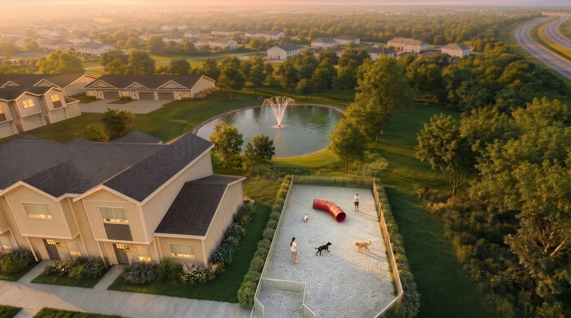
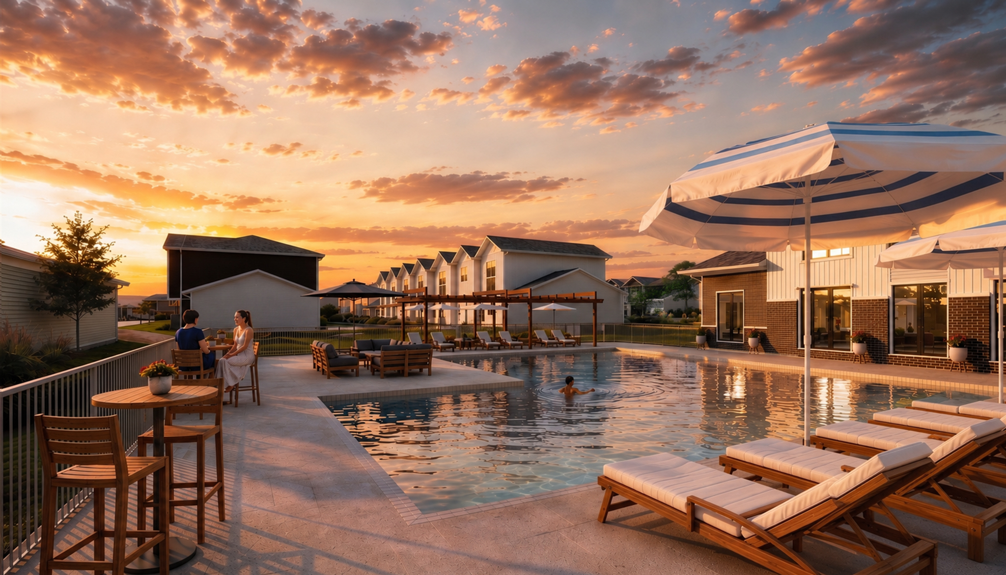
We introduced people, furnishings, landscaping, light, and activity to create vibrant scenes that help prospective residents picture themselves within the space.
Reshaping the Brand
CREATING THE BRAND & THE PLACE TOGETHER
We developed the identity alongside the visual experience of the community. Brand elements informed signage and environmental applications, while site plan and lifestyle renderings helped show the scale, character, and everyday experience of Marlow 35.
LOGO SYSTEM & VISUAL IDENTITY
A Distinct Mark
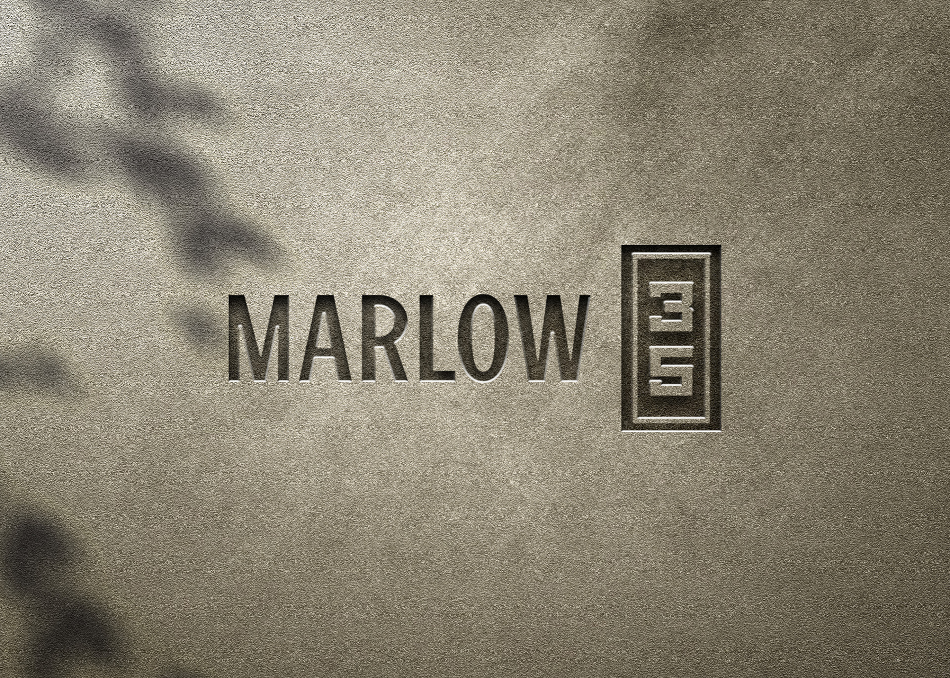
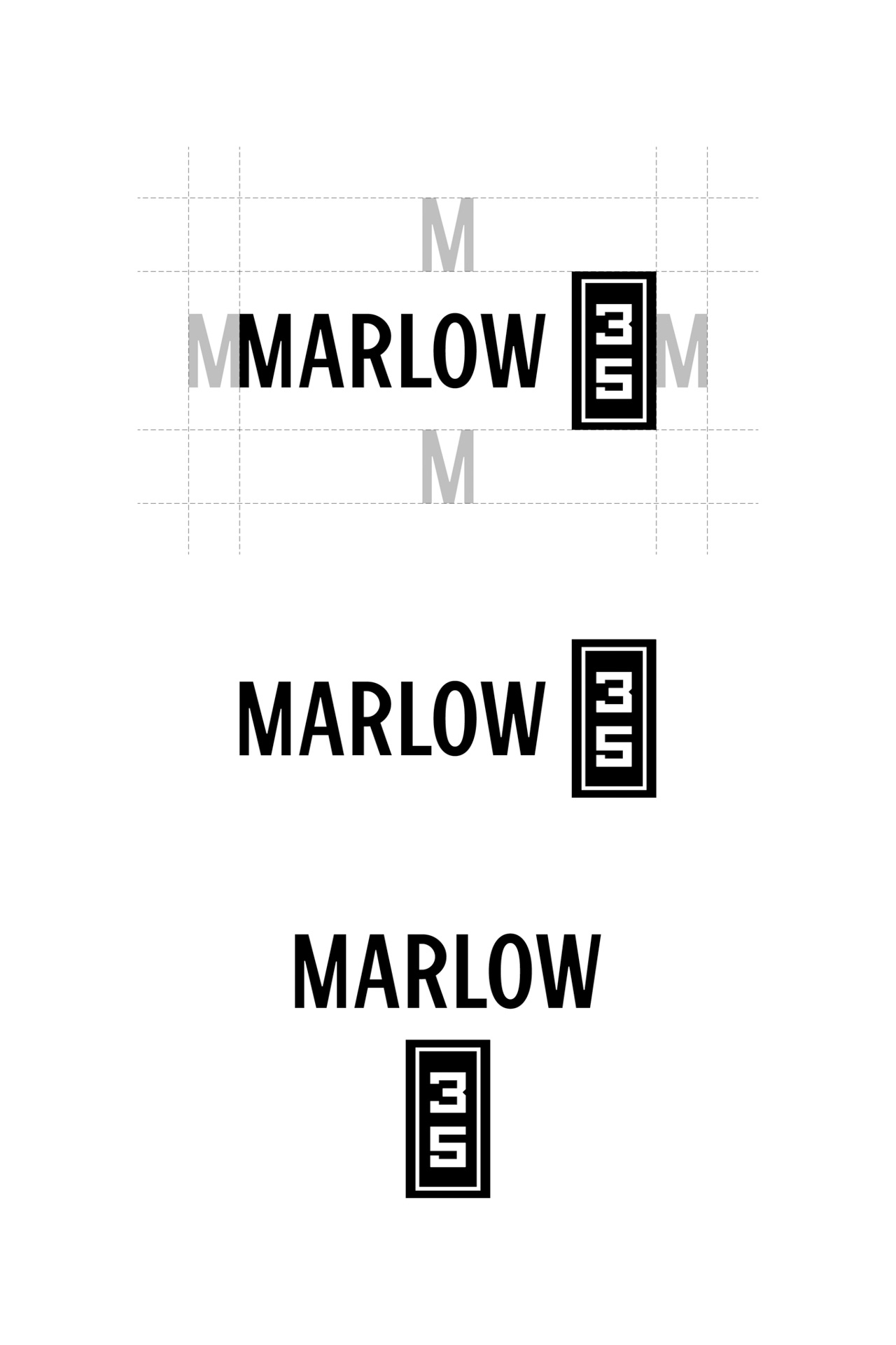
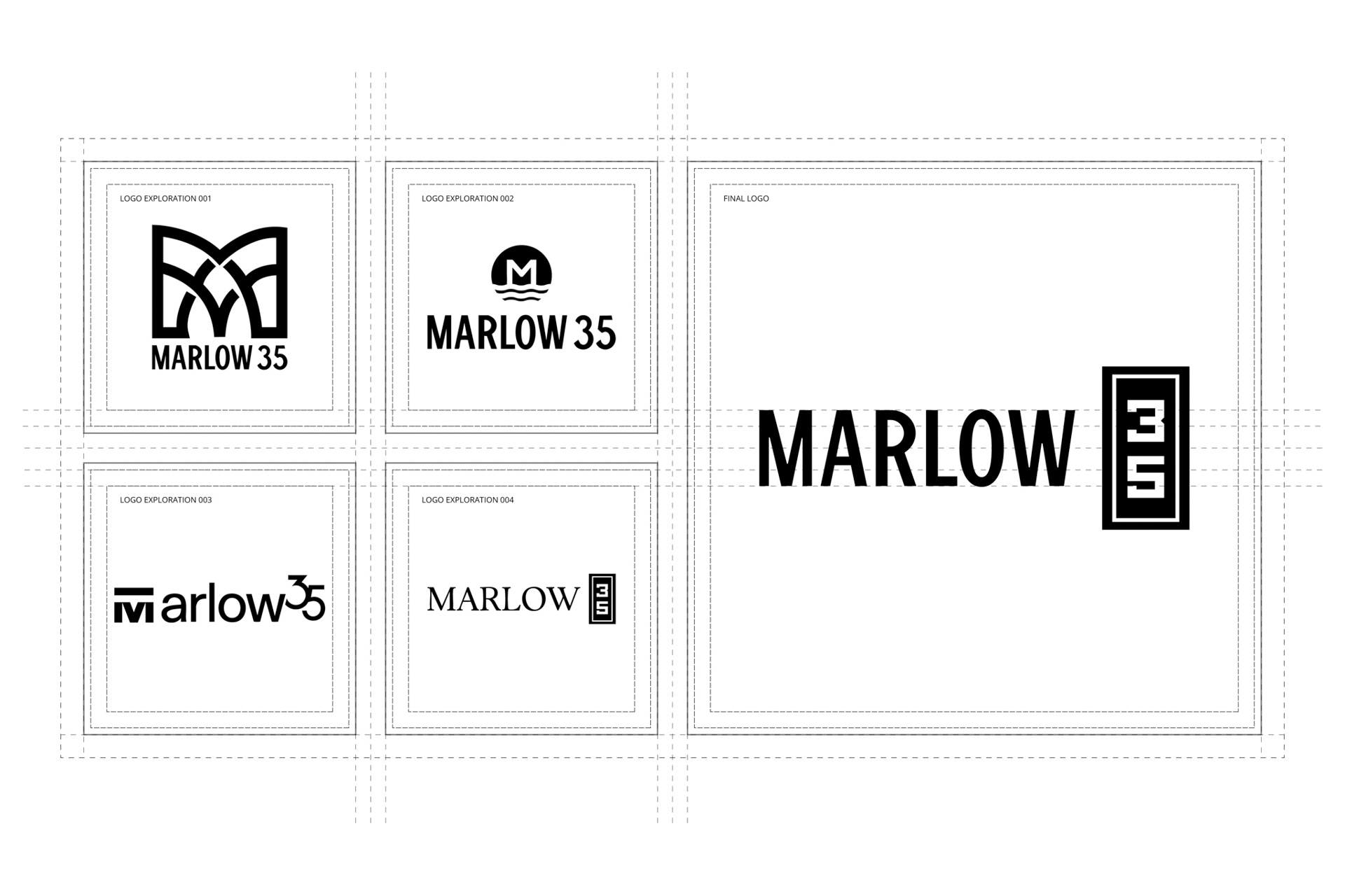
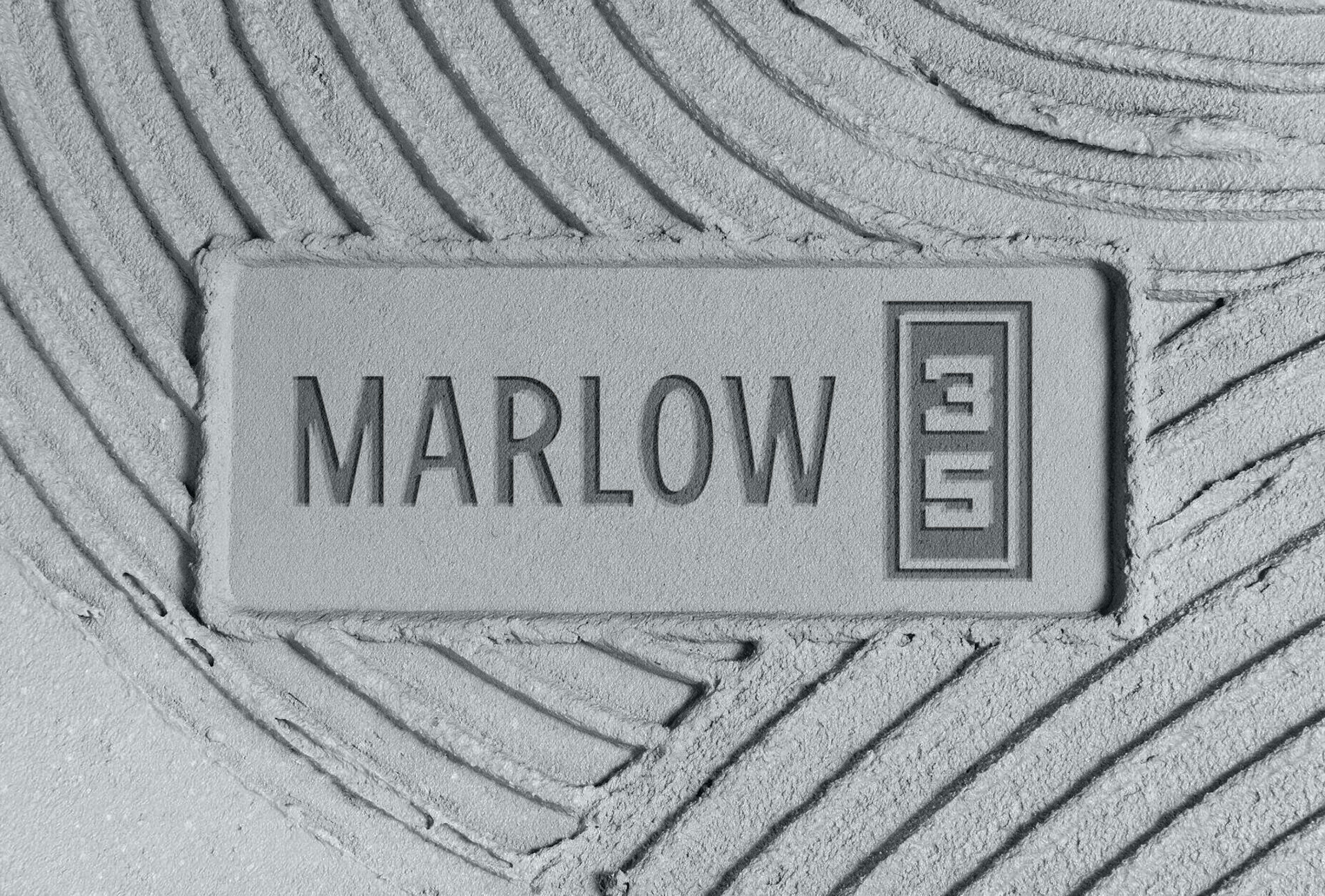
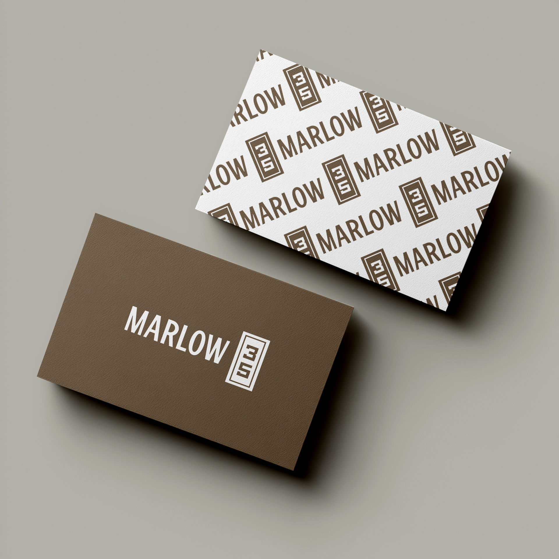
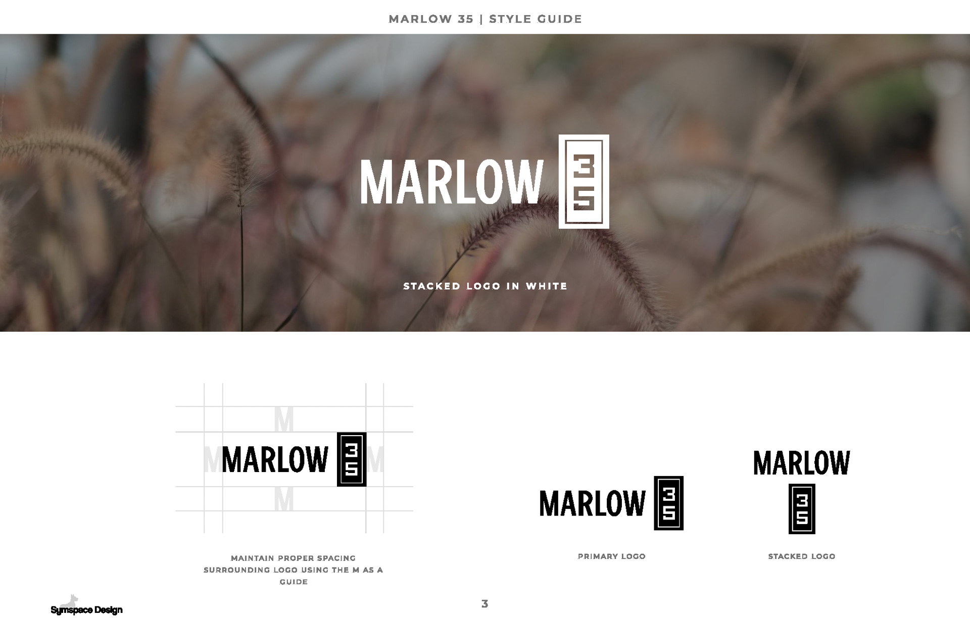
The Marlow 35 identity pairs a clean wordmark with a structured 35 icon, creating a recognizable mark that works across marketing, signage, and digital applications.
LOGO SYSTEM & VISUAL IDENTITY
A Distinct Mark
The Marlow 35 identity pairs a clean wordmark with a structured 35 icon, creating a recognizable mark that works across marketing, signage, and digital applications.
NATURAL COLOR & TYPOGRAPHY
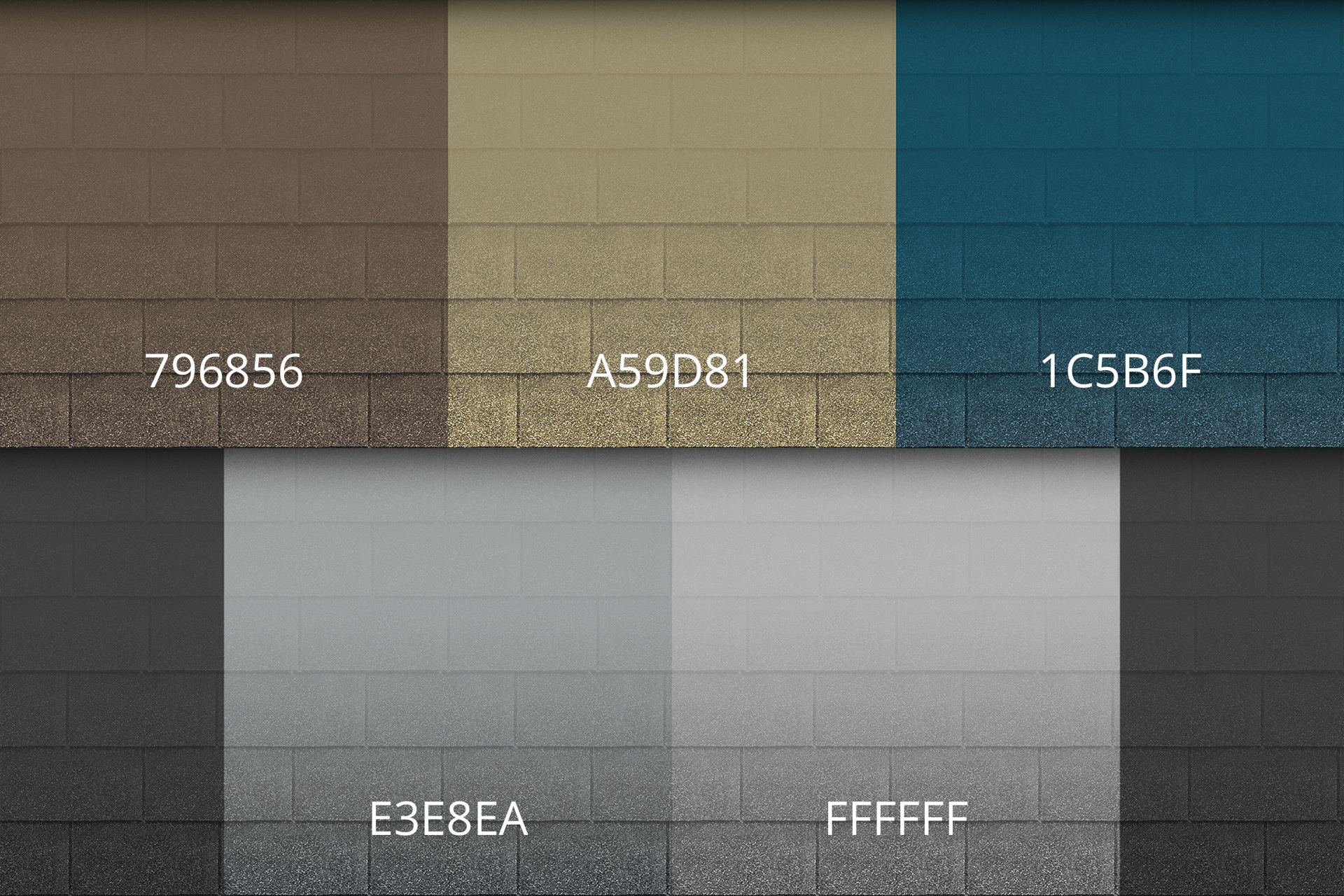
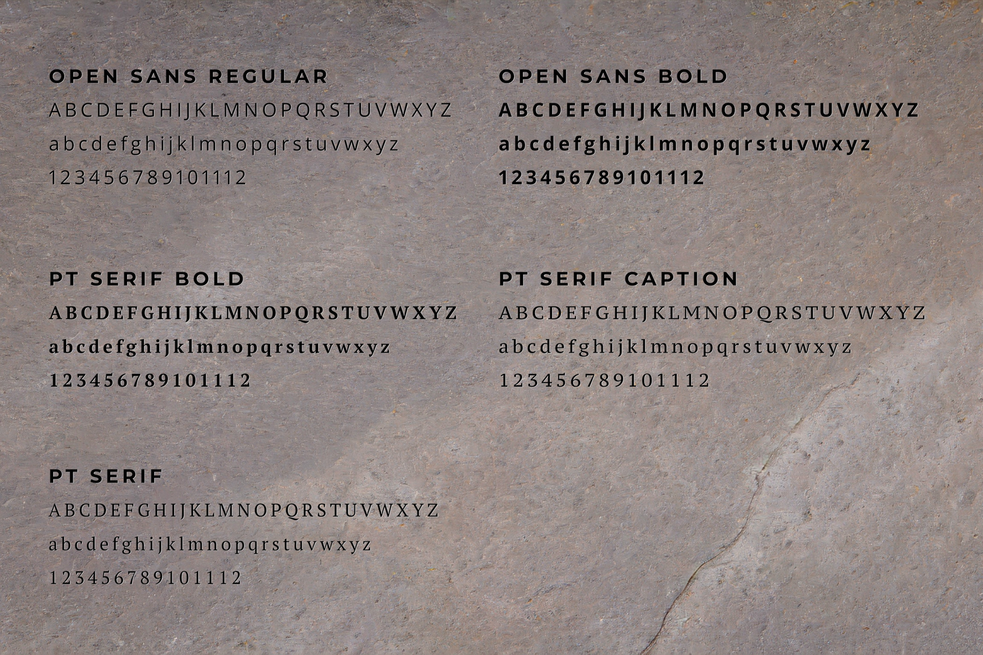
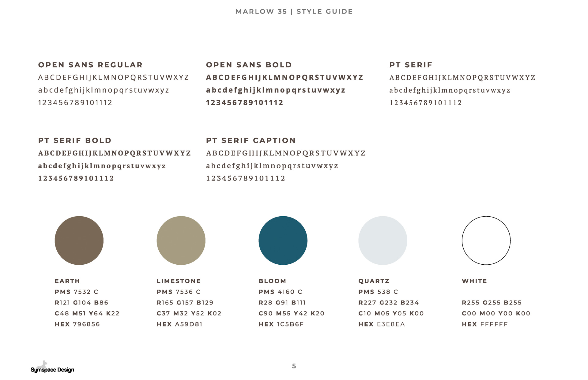
Earthy neutrals, soft blue, and warm natural imagery create a residential palette that complements the architecture and landscape. A simple serif and sans serif pairing gives the brand flexibility across marketing materials.
LIFESTYLE DIRECTION
Photography and supporting imagery focus on people, connection, outdoor spaces, and everyday life, giving Hubbell a consistent visual direction for marketing the community.



CARRYING THE IDENTITY ONTO THE PROPERTY
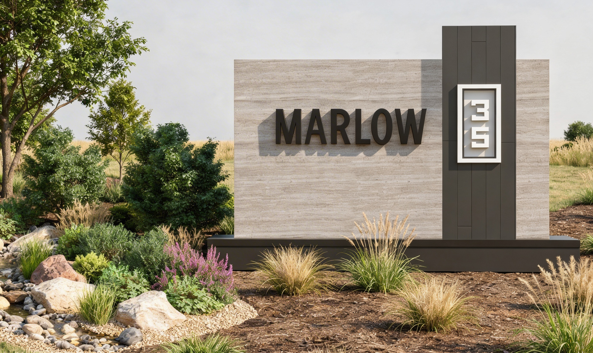
We extended the Marlow 35 identity into monument signage designed specifically for the development. Materials, proportions, typography, and the vertical 35 mark connect the physical entrance directly back to the brand.
SITE PLAN VISUALIZATION
Seeing the Community as a Whole
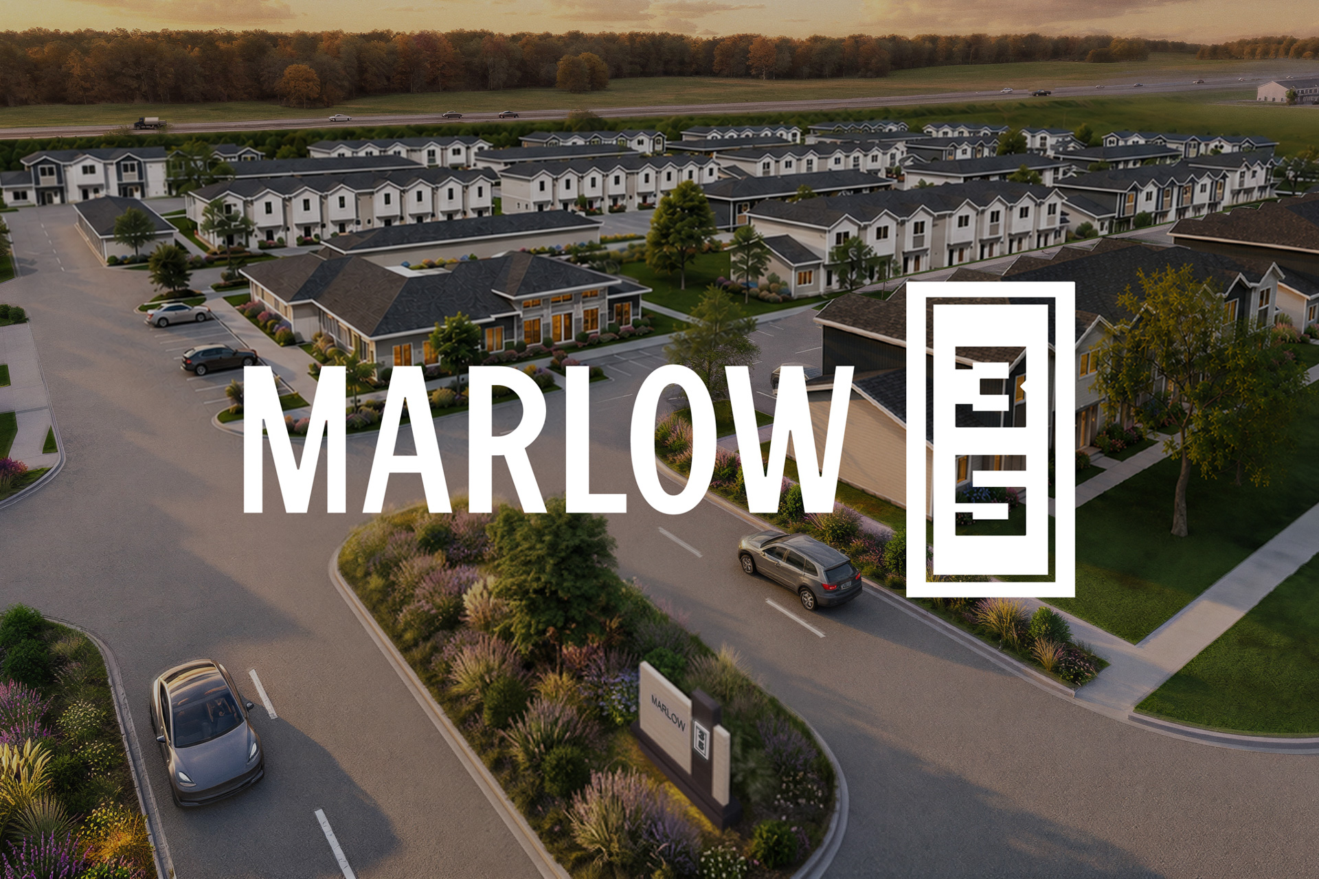
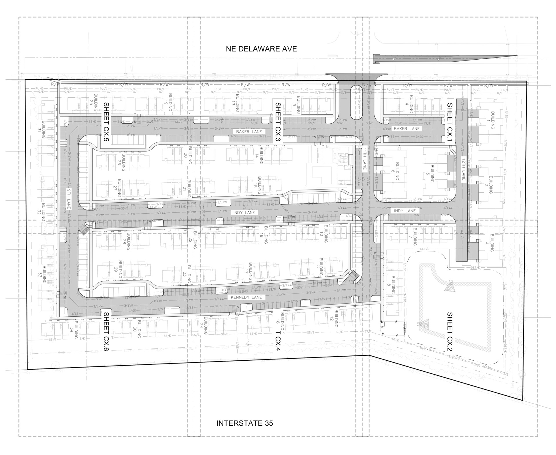
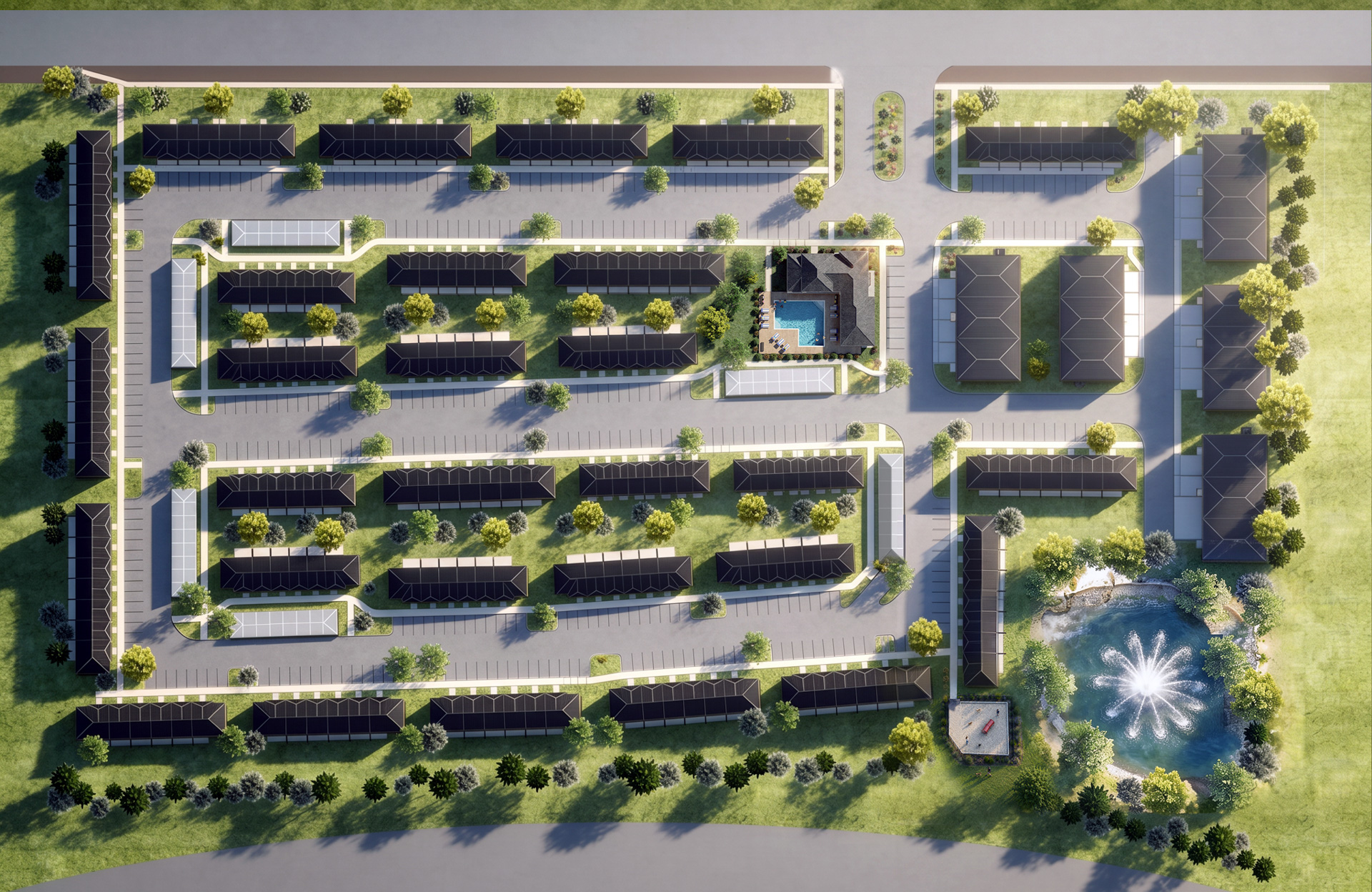
Working from the site plan and architectural information, we visualized Marlow 35 as a complete development rather than a collection of individual buildings.
The resulting aerial view communicates the scale of the property, housing types, circulation, landscaping, amenities, and overall relationship between the different areas of the community.
LIFESTYLE RENDERING
Creating a Sense of Life
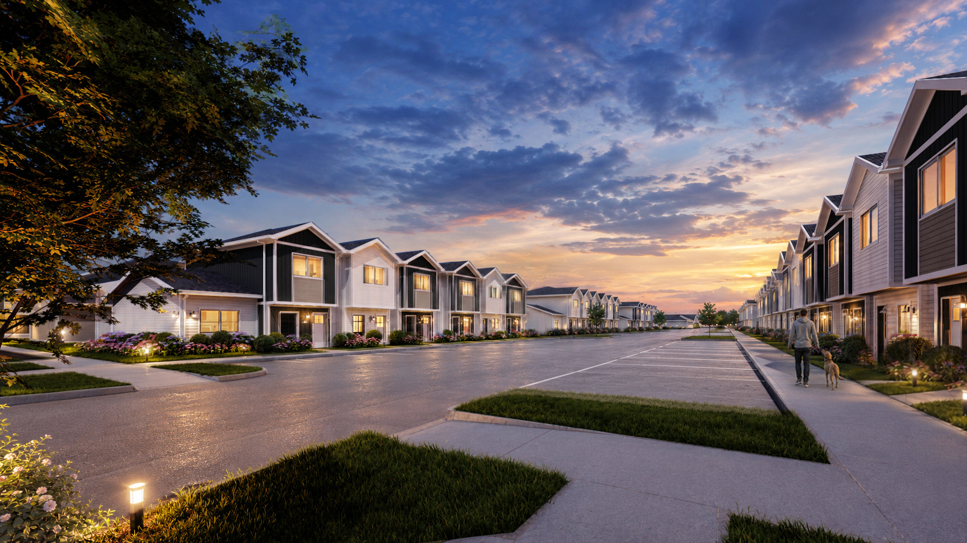
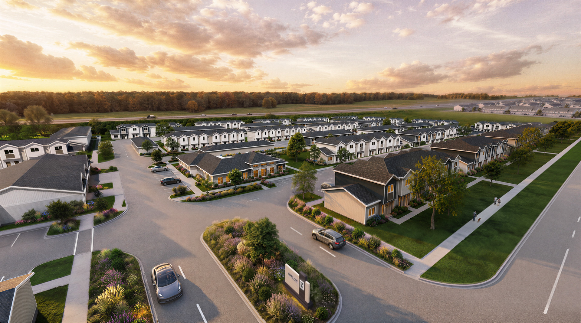
Our lifestyle renderings focus less on simply documenting architecture and more on showing how a space could actually be experienced.
People, furniture, landscaping, natural light, activity, and smaller lived-in details turn architectural information into scenes that feel active, welcoming, and ready to experience.

Strategic Partnership
Supporting Hubbell Beyond a Single Project
Our work with Hubbell extends beyond Marlow 35. As an ongoing design partner, we help their team develop property brands, visual assets, environmental applications, and renderings that support projects from early development through marketing.
Clear Brand Guidelines
We create practical brand standards that give Hubbell’s internal marketing team the colors, typography, imagery, logos, and visual direction needed to use each property brand consistently.
Digital + Physical Thinking
Our graphic design and commercial interior design backgrounds allow us to consider how an identity will work across marketing materials, signage, architecture, and the property itself.
Visualization Support
We help translate plans and architectural information into visuals that make new developments easier to understand, market, and experience before construction is complete.

.jpg)




Building Marlow 35 From Brand to Place
A Recognizable Identity
A complete visual system established Marlow 35 as its own community while giving Hubbell clear brand standards for ongoing marketing.
A Clear View of the Development
Site plan visualization brought the full property together, making its scale, layout, amenities, and residential areas easier to understand.
A More Lived-In Perspective
Lifestyle renderings added people, activity, landscaping, furnishings, and atmosphere to help prospective residents see more than the architecture.
By developing the brand alongside its physical and visual applications, Marlow 35 has a consistent identity from the first marketing touchpoint to the entrance of the community itself.