BrownWinick

The Client & Challenge
As a premier business-focused law firm in Des Moines, BrownWinick partners with some of the Midwest's most innovative companies.
However, their visual identity didn't reflect the dynamic, contemporary nature of their practice. They tasked us with a strategic brand overhaul to bridge this gap. We created a modern visual system that honors their established industry authority while positioning them for the future.
.jpg)
The Challenge:
Entering the Evolve Phase
When we assess a new partner, we look at where they stand in their business lifecycle. BrownWinick was squarely in what we call the "Evolve" phase.They were already a highly functional firm doing excellent work, but their brand had not expanded with them. They deliver strong commercial solutions across the Midwest, yet their visual presence felt left behind.Internally, this meant their teams were working without a unified system. They lacked consistent templates, a core color palette, and clear guidelines, making it difficult to find the right assets and build cohesive materials.
The Approach:
Building a Unified Ecosystem
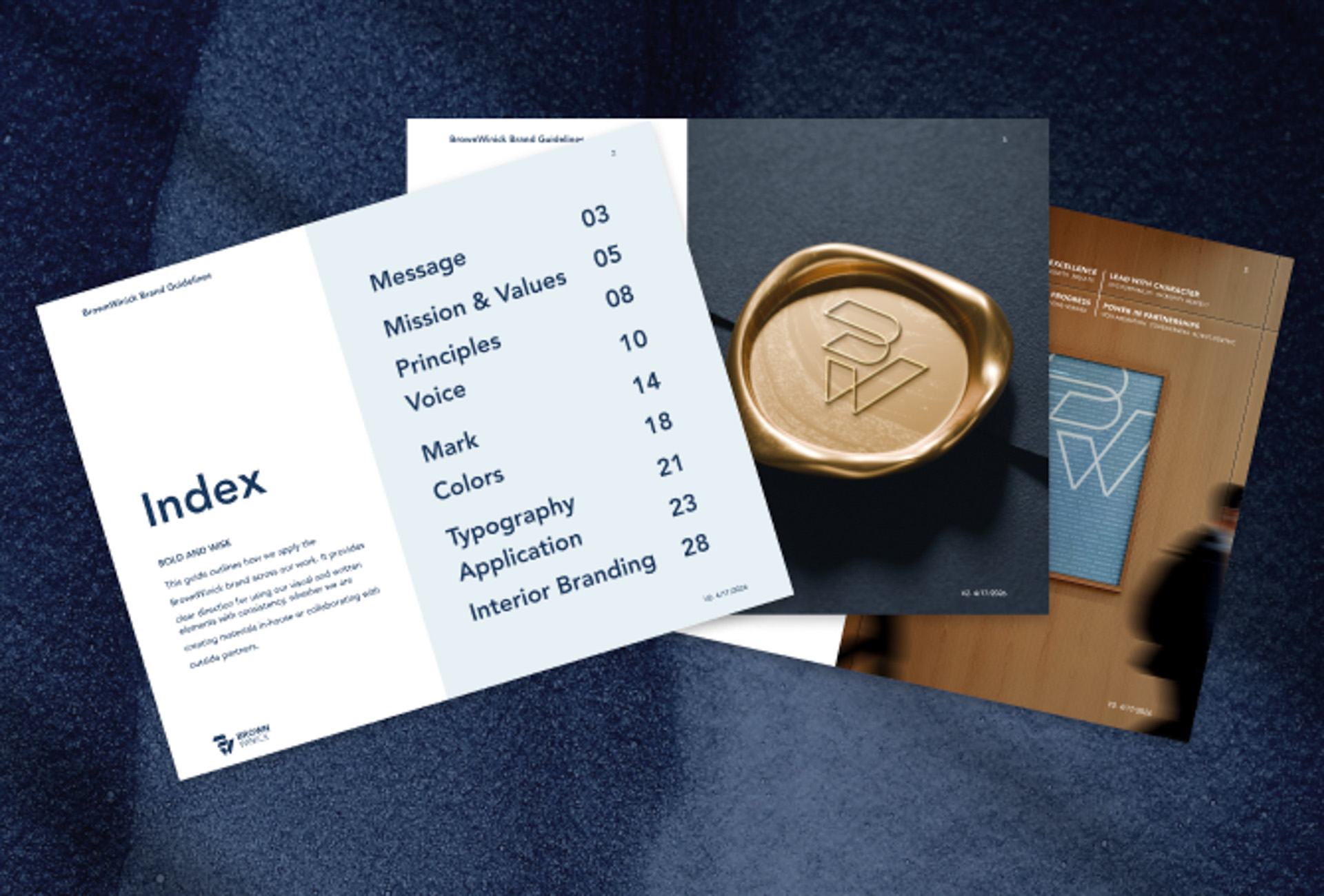
To guide this evolution, we built a comprehensive visual system. We treat brands as living ecosystems. By aligning BrownWinick's digital assets, printed materials, and physical spaces under one cohesive strategy, we reduced fragmentation and gave their internal teams the exact tools they need to execute confidently. This unified approach drove the specific solutions we developed for their firm.
Problems & Solutions

Unrefined Logo & Missing Elevation
The existing logo felt flat and lacked the visual polish expected of a modern law firm. It also lacked clear rules for consistent application.

Elevated Mark with Heritage Respect
We modernized and polished the logo to create a refined mark that pays homage to the original brand identity. This update includes clear lockups and defined clear-space rules.
Inconsistent Apparel & Physical Print
Without tested print guidelines or vendor standards, internal team apparel and physical marketing materials varied widely in color, quality, and logo presentation.
Standardized Production Guidelines
We thoroughly tested brand colors for digital print and physical goods. Providing clear CMYK specs and Pantone reference standards helps ensure physical apparel and print materials match reliably.
Inconsistent Cross-Media Execution
A lack of standardized asset rules meant collateral across print materials, pitch decks, and digital touchpoints felt fragmented and hard to maintain.
Created a Scalable System
We delivered a unified design framework that equips internal teams to build collateral quickly, accurately, and consistently across various mediums.
Reshaping the Brand

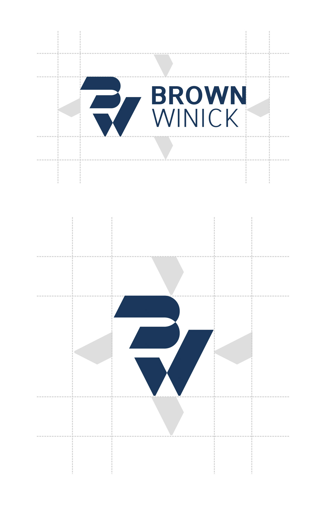
LOGO SYSTEM & VISUAL MARK
1. Systematizing the Mark
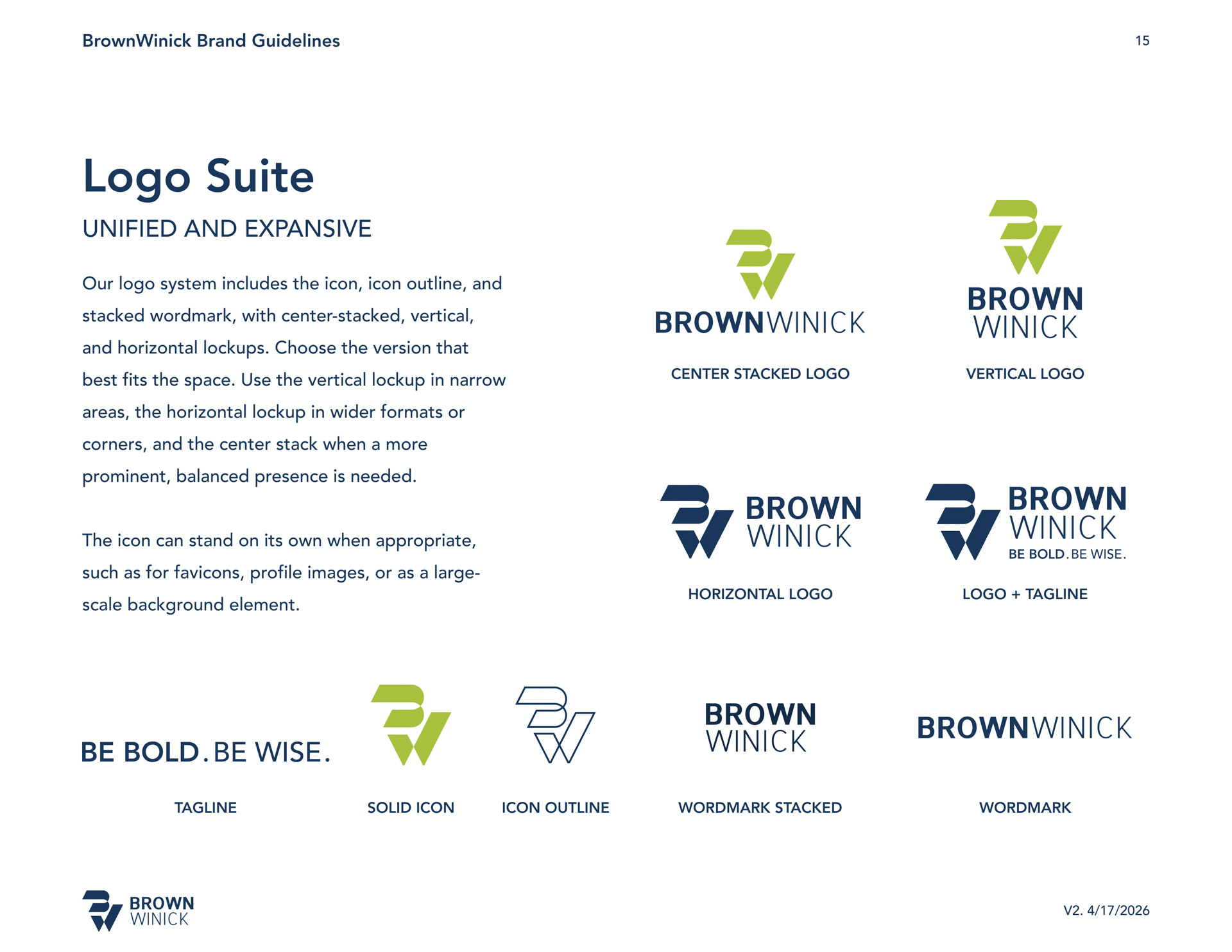
BrownWinick required clear, repeatable rules for their logo. We organized their core visual identity into a versatile system that includes the primary icon, icon outline, and wordmark. The updated structure gives the mark a balanced, professional presence across high-contrast print collateral and modern digital screens.
2. Versatile Lockups for Every Format
Vertical Lockup: Optimized for narrow spaces, portrait documents, and tall banners.
Horizontal Lockup: Designed for wide formats, digital headers, and corner placements.
Center-Stacked Lockup: Used when a bold, balanced, and centered brand presence is required.
Standalone Icon: Functions independently in small digital touchpoints like favicons and social profile avatars, or scales up as a subtle background texture.
3. Clear Space & Proportional Integrity
The "W" Clear Space Rule: To protect the mark's visual impact, minimum clear space is measured using the smallest portion of the icon's "W". This provides the logo with sufficient breathing room to stand out.
Usage Standards: The mark must be rendered as provided without stretching, recoloring, or altering lockup proportions. This maintains strong visual consistency across applications.
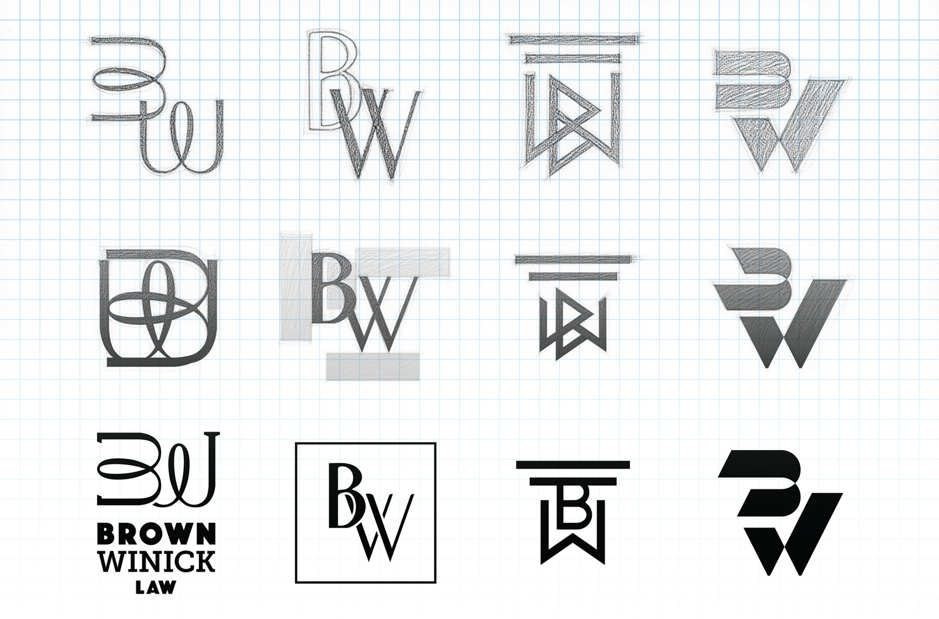
Form Exploration:
We explored dozens of typographic combinations to find a monogram that balances modern geometry with the firm's established authority.
Structural Refinement:
We defined exact proportions, angles, and line weights to build a cohesive mark that feels grounded and visually balanced.
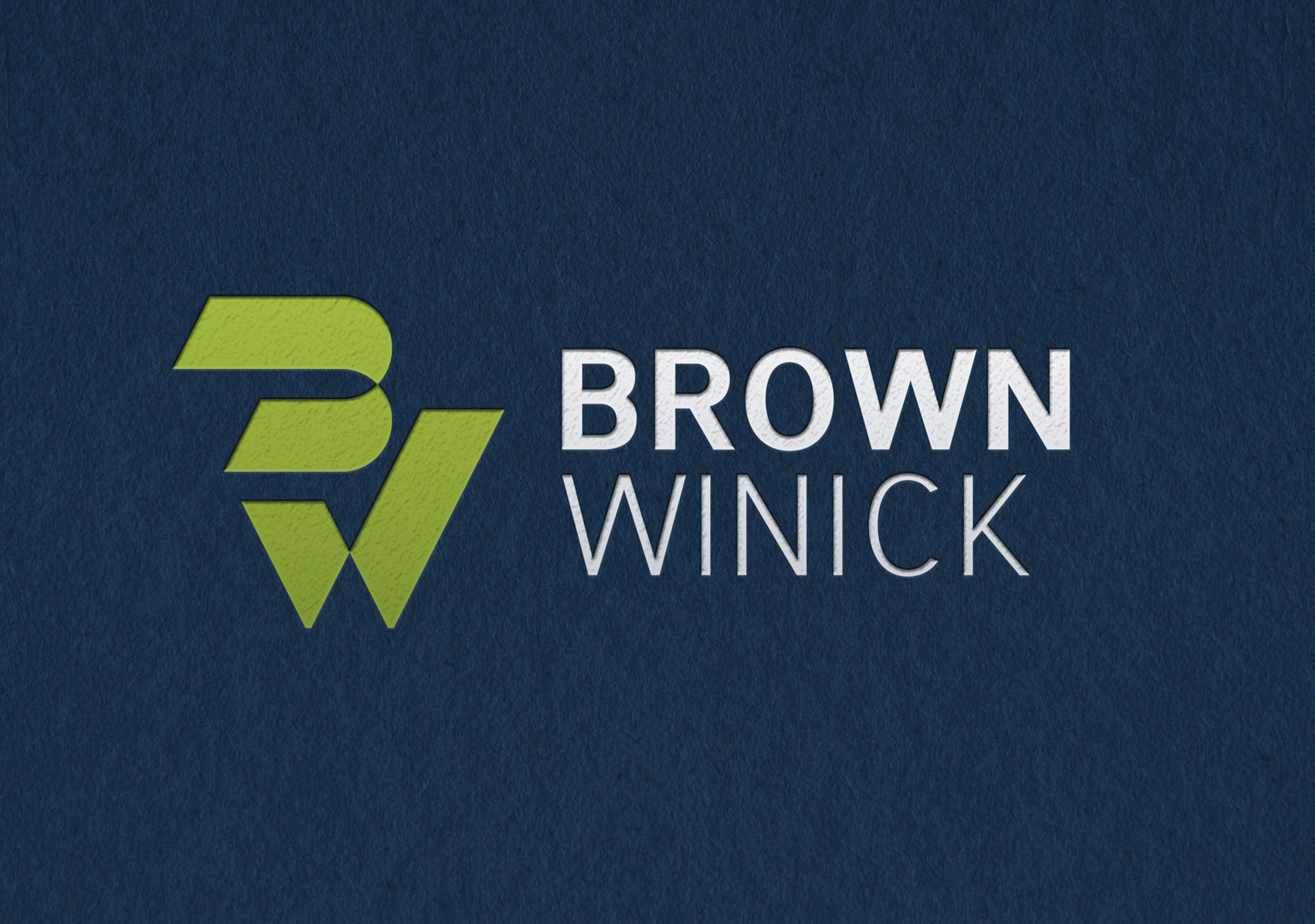
The Elevated Mark:
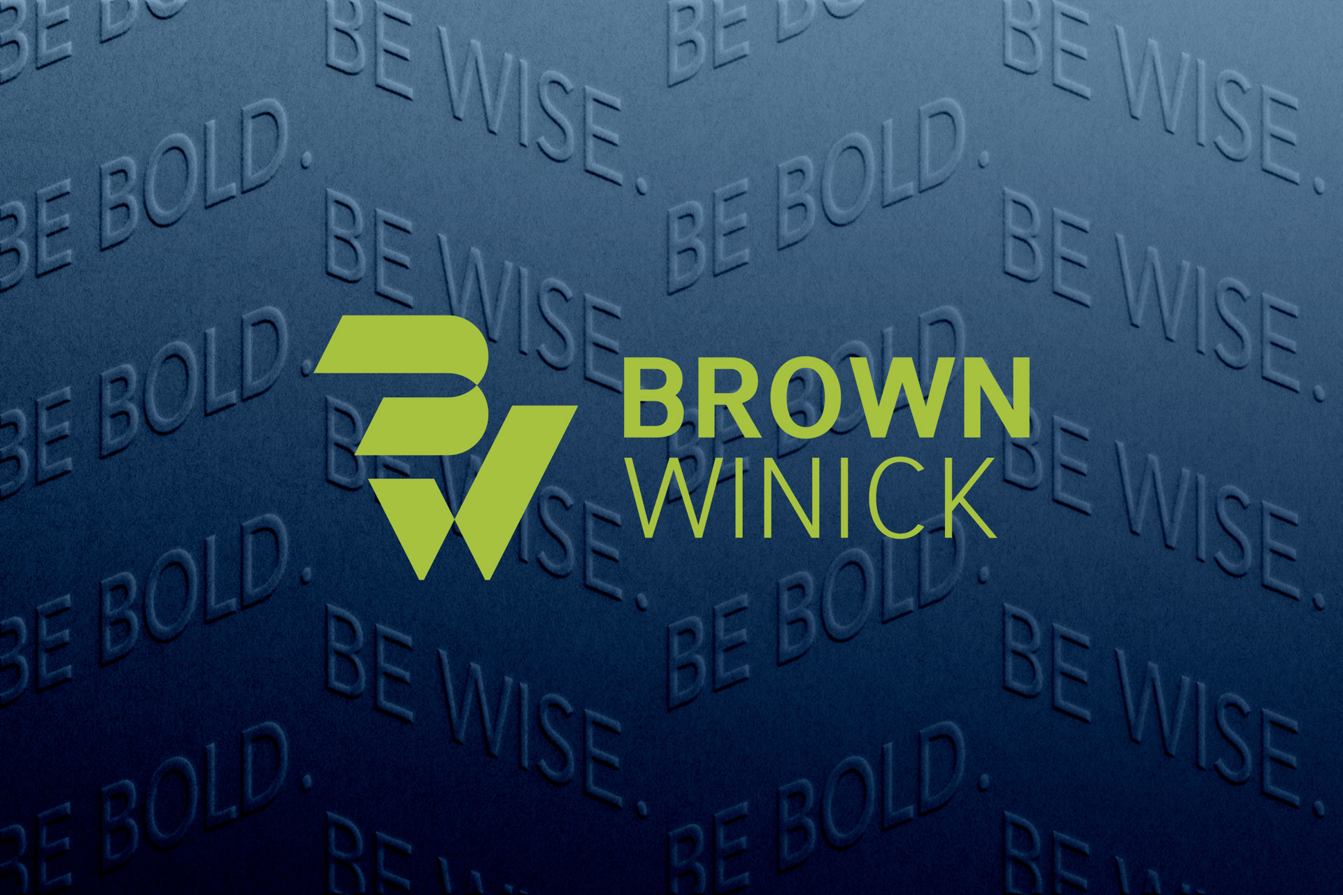
We applied the core color palette and precise lockup rules to create a confident, modern visual anchor for the brand.
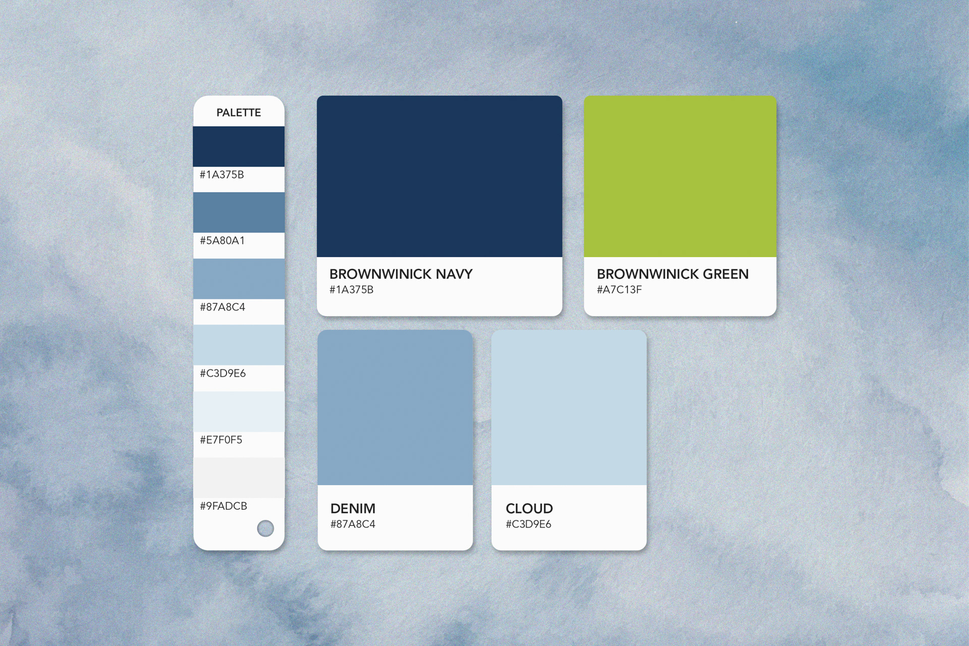
COLOR SYSTEM
Color Pairing & Accessibility
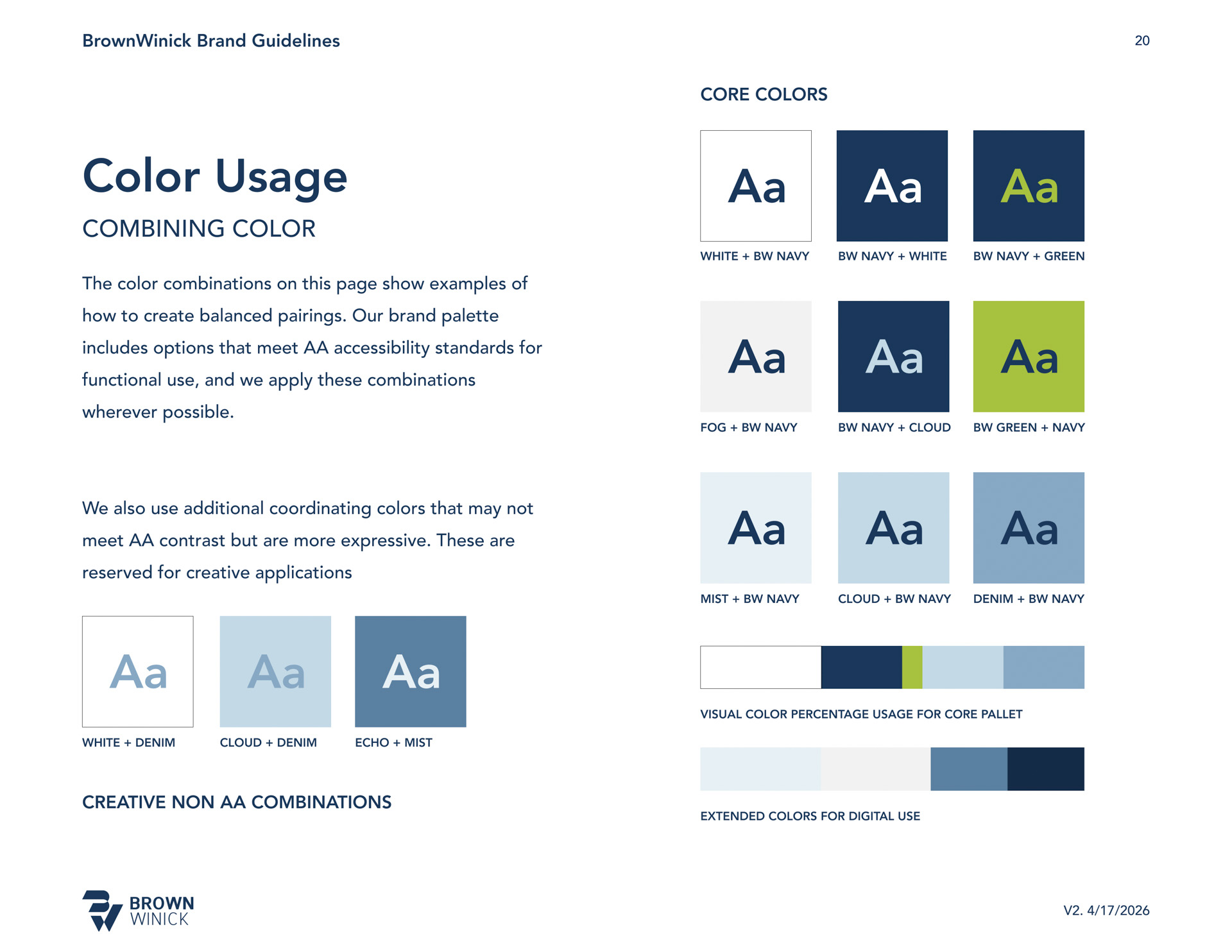
We built a balanced color palette to manage the firm's visual identity with intention.
AA Accessibility Standards
The core palette is engineered to meet WCAG Level AA accessibility standards. These high-contrast pairings are applied specifically for functional readability and clear communication.
Expressive Coordinating Colors
We developed coordinating colors to bring dynamic depth to the brand. These shades are reserved for creative applications, backgrounds, and graphic layouts rather than primary text.
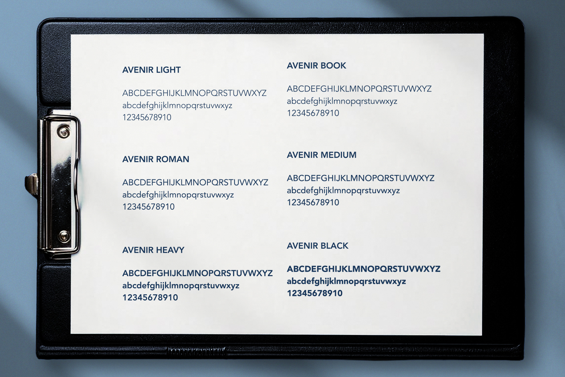
TYPOGRAPHY SYSTEM
Type & Visual Voice
We structured a clean typographic hierarchy to shape a professional and consistent brand voice.
Primary Typeface
Selected to drive the brand's core identity. This clean, geometric sans-serif provides a modern, approachable aesthetic that reinforces the firm's clarity.
Fallback Typeface
Designated as a compatible, system-safe alternative for internal documents and digital platforms. This ensures the visual structure remains intact and on-brand even when the primary font is unavailable to a user.
PHOTOGRAPHY DIRECTION
We developed a photography direction to reflect how the firm operates: confident, approachable, and focused. Moving away from stiff corporate tropes, these guidelines prioritize a strong sense of presence and genuine human connection.
Human-Centered Intent
Guidelines focus on capturing subjects with purpose. Precise lighting brings clarity to facial expressions, creating an authentic connection with the viewer.
Balanced Tones & Natural Light
Color grading and lighting standards ensure shots feel warm and natural. This approach keeps environmental colors naturally aligned with the firm's core navy and supporting palette.
Environmental Context
Human portraiture is paired with grounded textures and real-world client environments to represent the actual industries and spaces the firm serves.

.jpg)

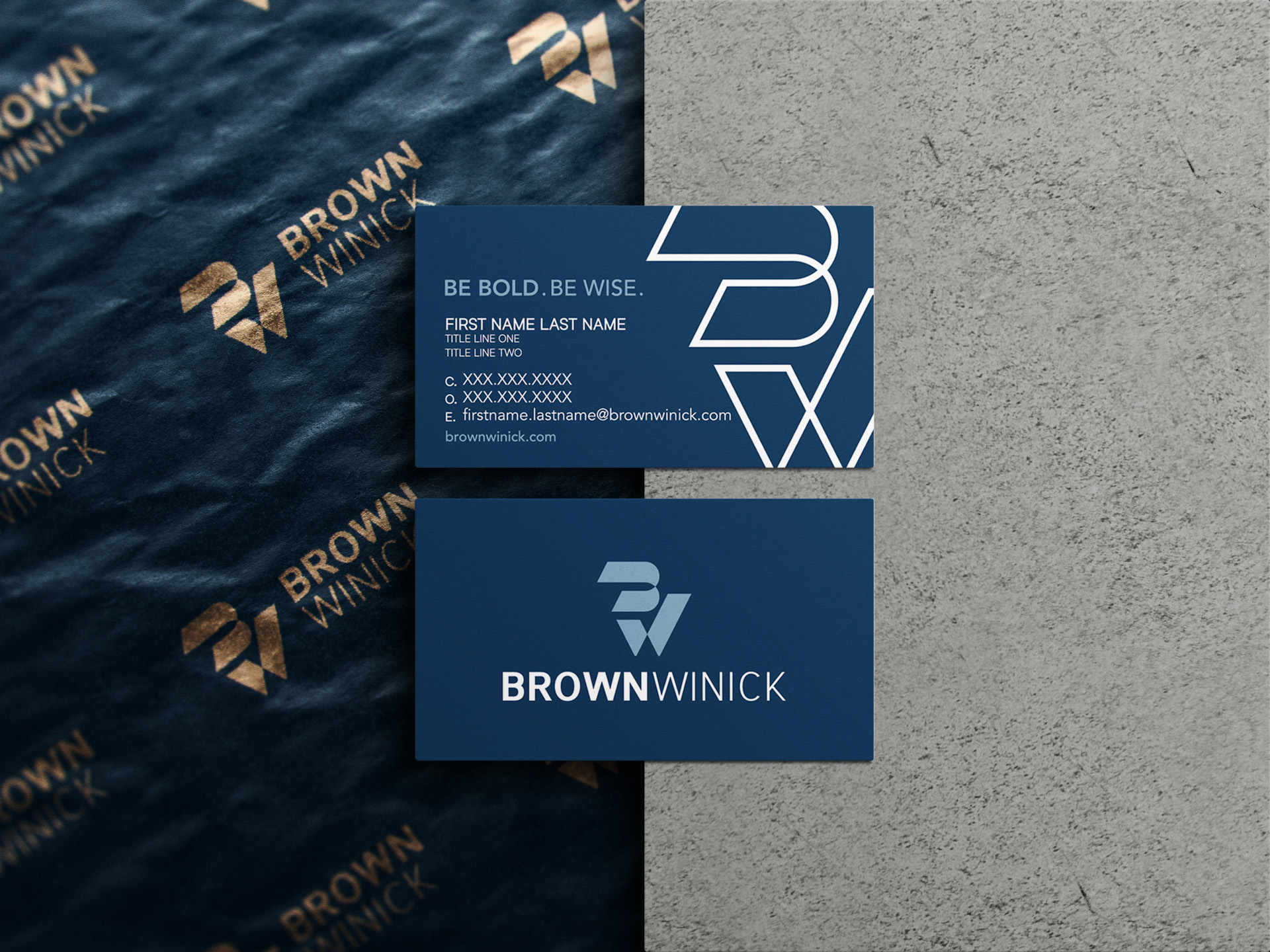
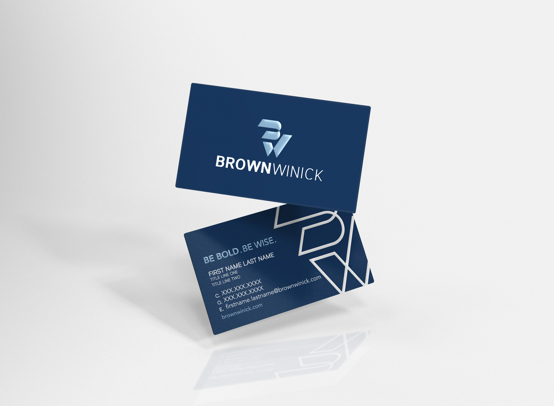
BUSINESS CARDS & MARKETING PORTAL
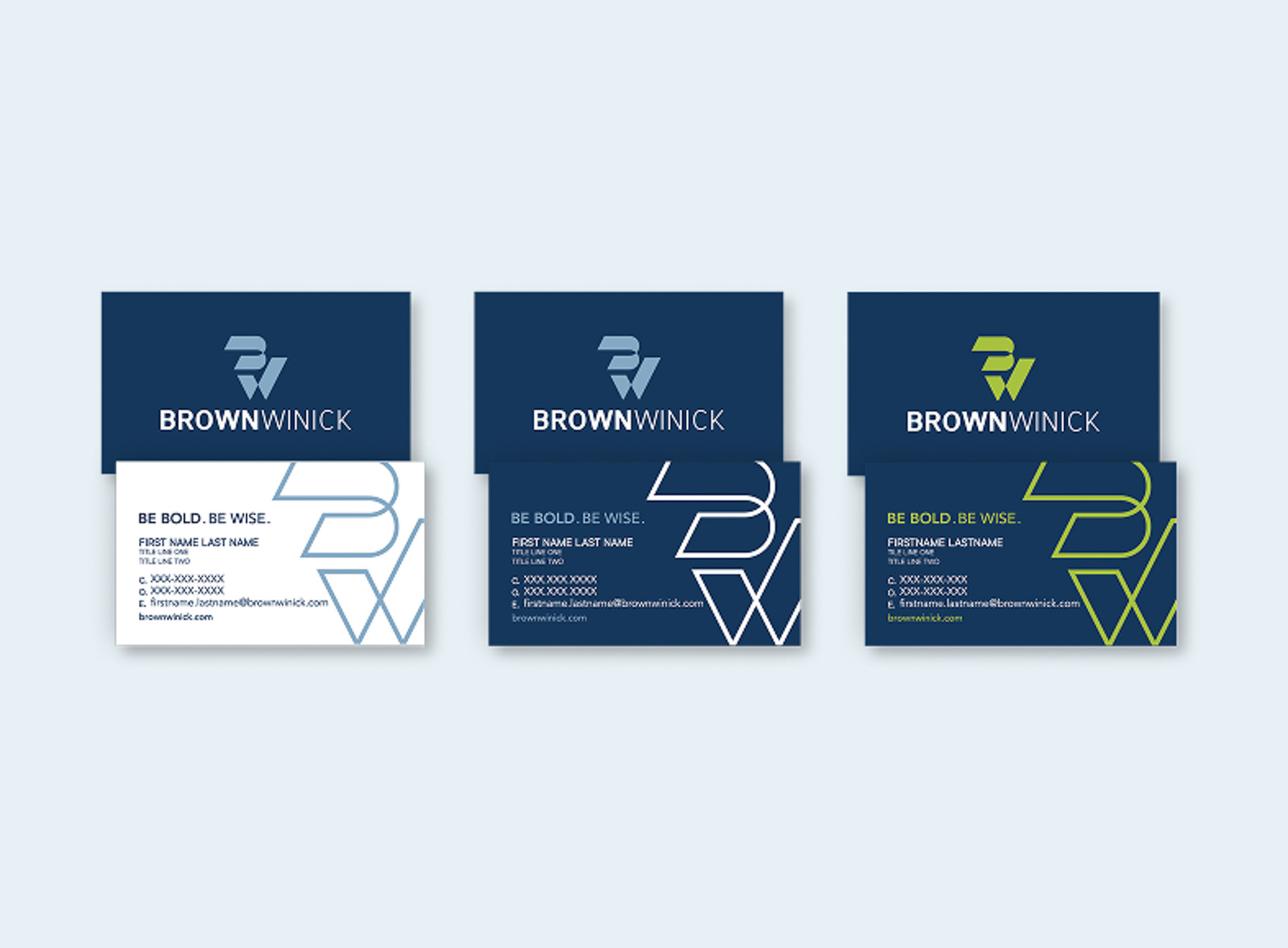
We designed BrownWinick's business cards to translate their new visual identity into a memorable, personal exchange. To support the growing firm at scale, we coordinated a seamless print and ordering system tailored specifically for their internal teams.
220+ Employee Templates
We pre-configured over 220 unique business card layouts. This ensures the team maintains consistent brand proportions, clear space, and typography standards across the board.
Corporate Ordering Portal
We deployed a streamlined ordering portal featuring 16 turnkey print templates. This provides the firm with direct, self-service access to order marketing collateral on demand.
Dedicated Support & Pricing
We coordinated prioritized corporate pricing and secured a dedicated account manager. This vendor alignment supports reliable print quality and fast turnarounds for the firm.
STATIONERY & CUSTOM TEMPLATES
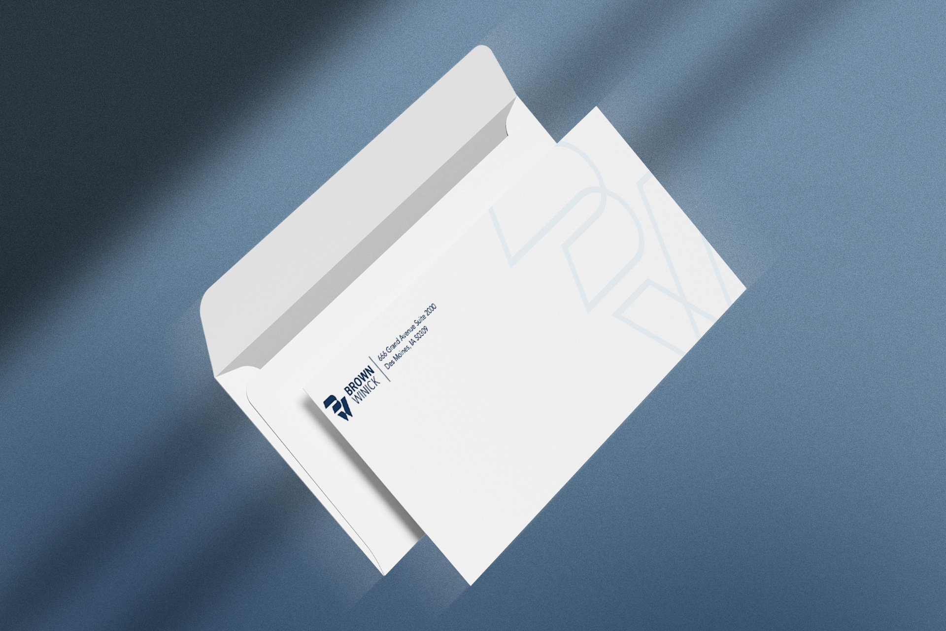
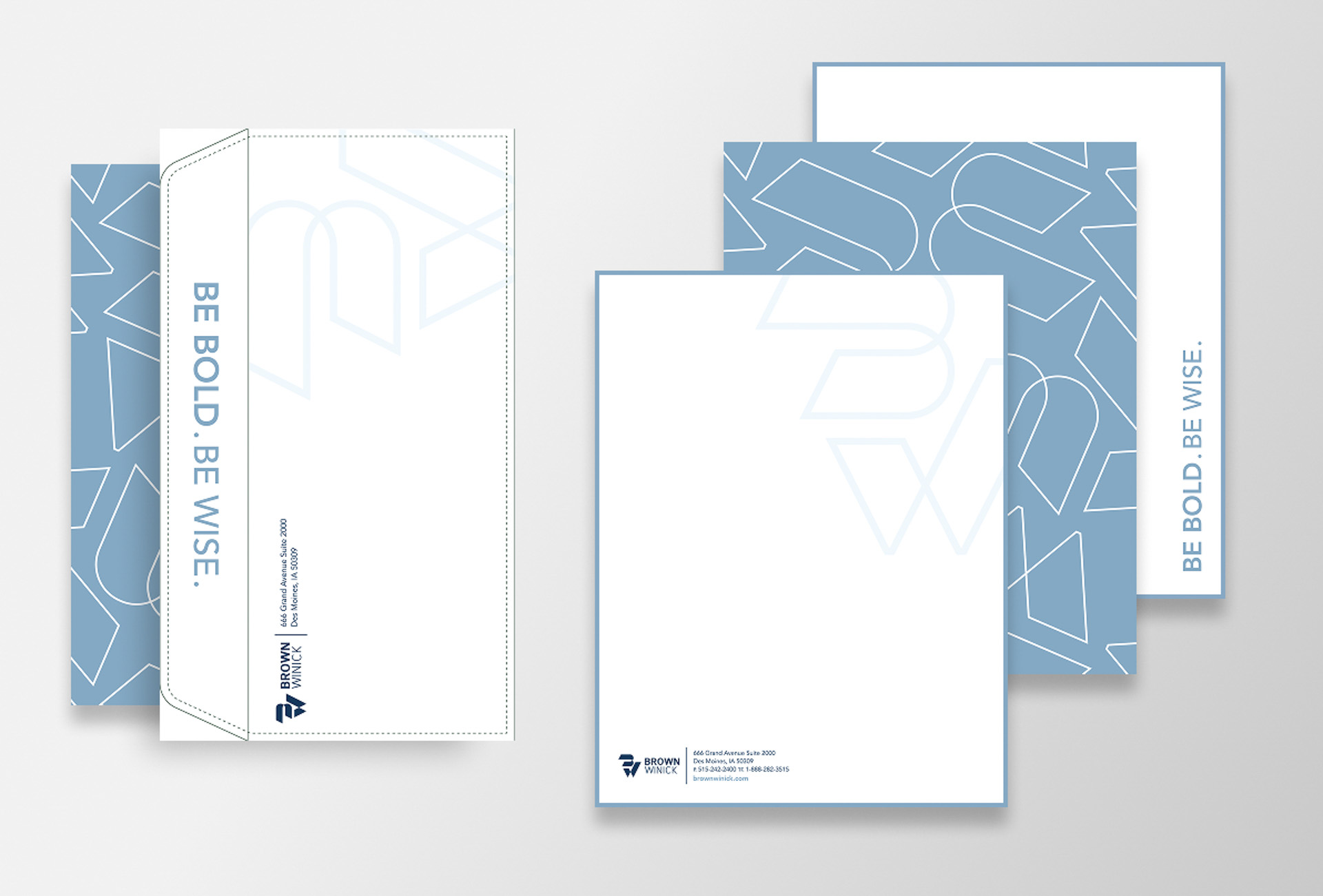
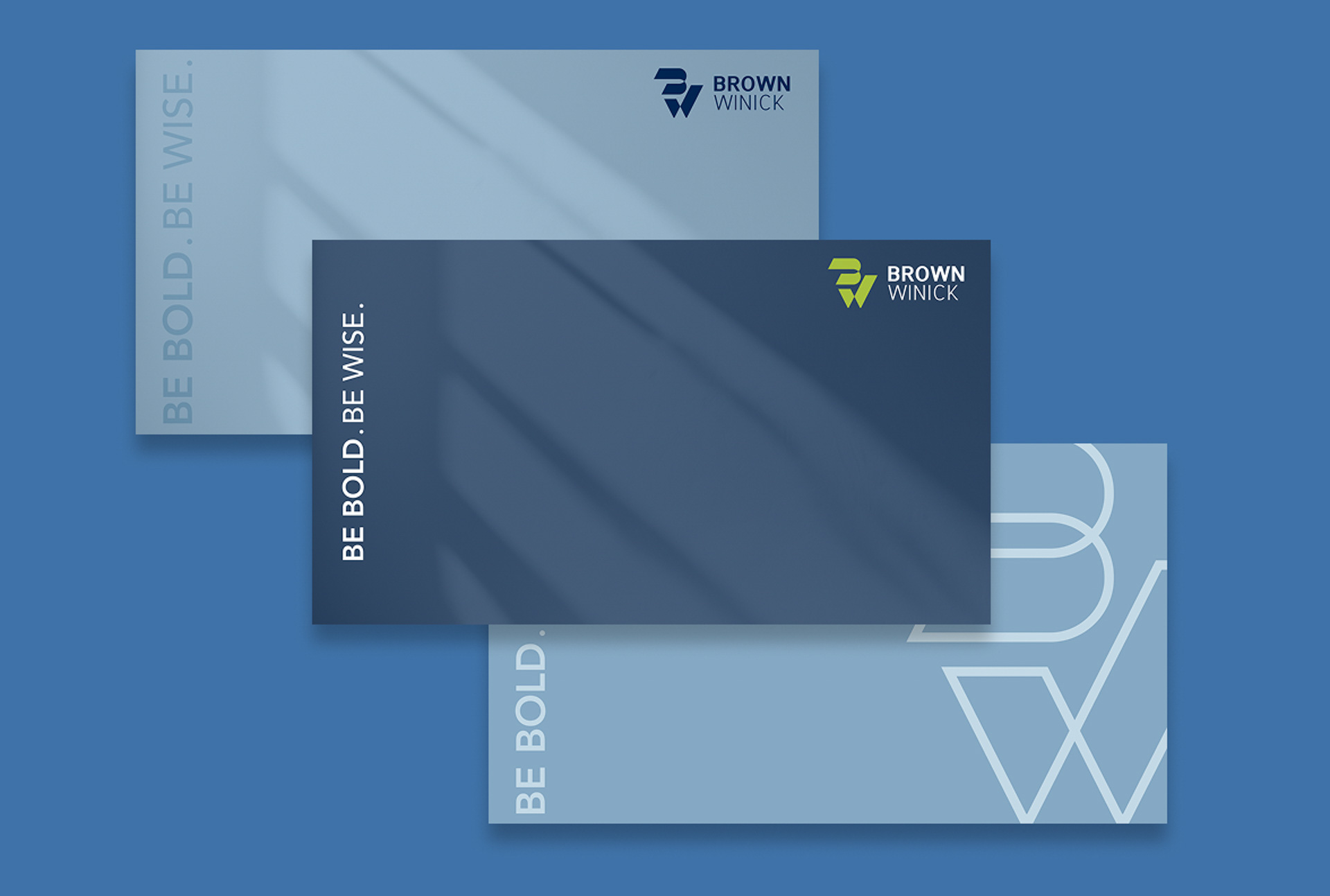
We designed BrownWinick's official stationery system to bring the brand into physical client touchpoints with elegance and tactile weight. Custom letterheads, envelopes, and note cards combine functional clarity with structural design details.
Custom Pattern Integration
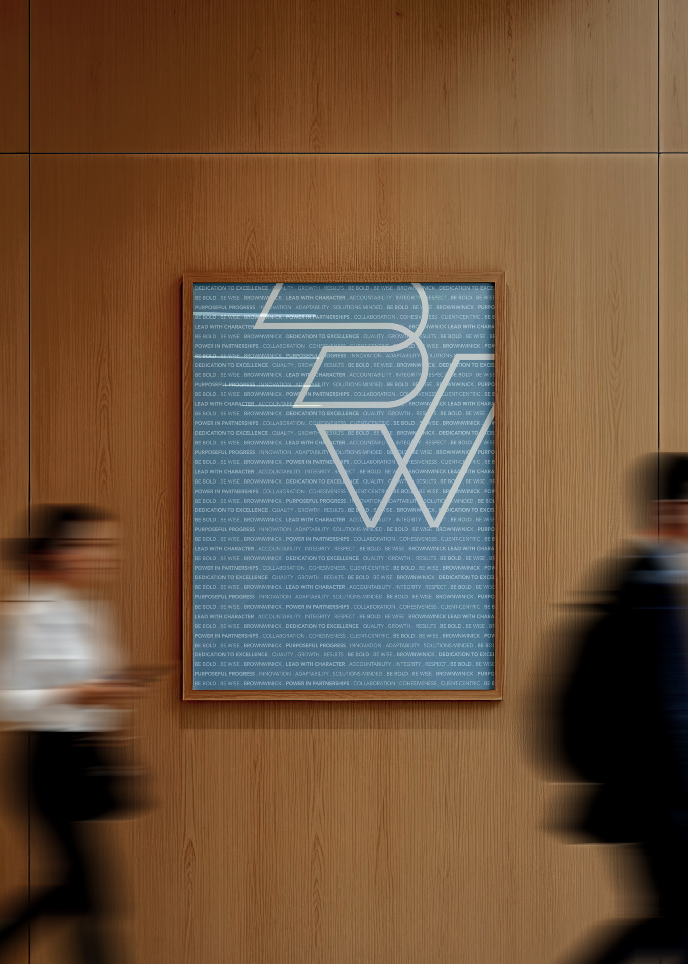
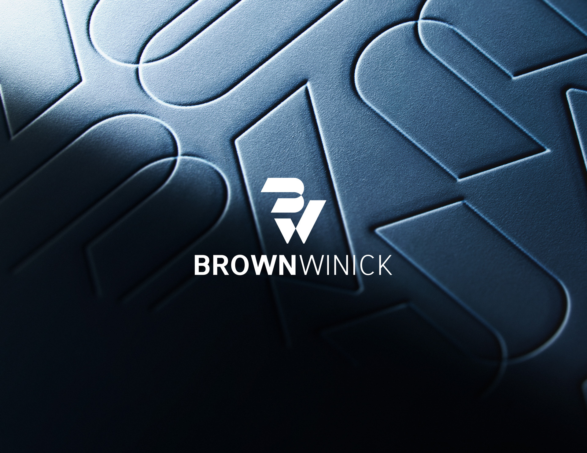
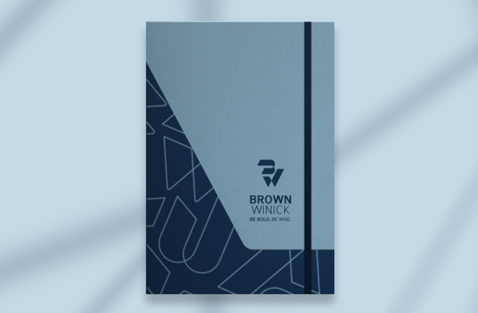
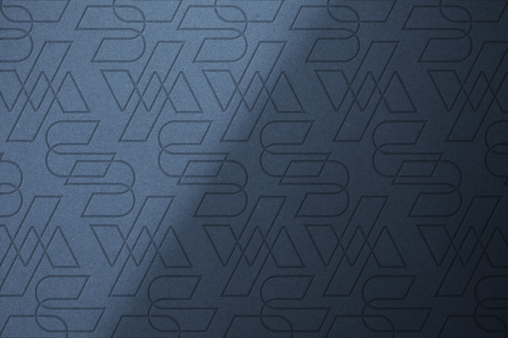
We developed an architectural line-pattern derived from the "BW" mark. It functions as a subtle watermark accent on fronts and a bold graphic element on envelope interiors and backs.
Integrated Tagline Detail
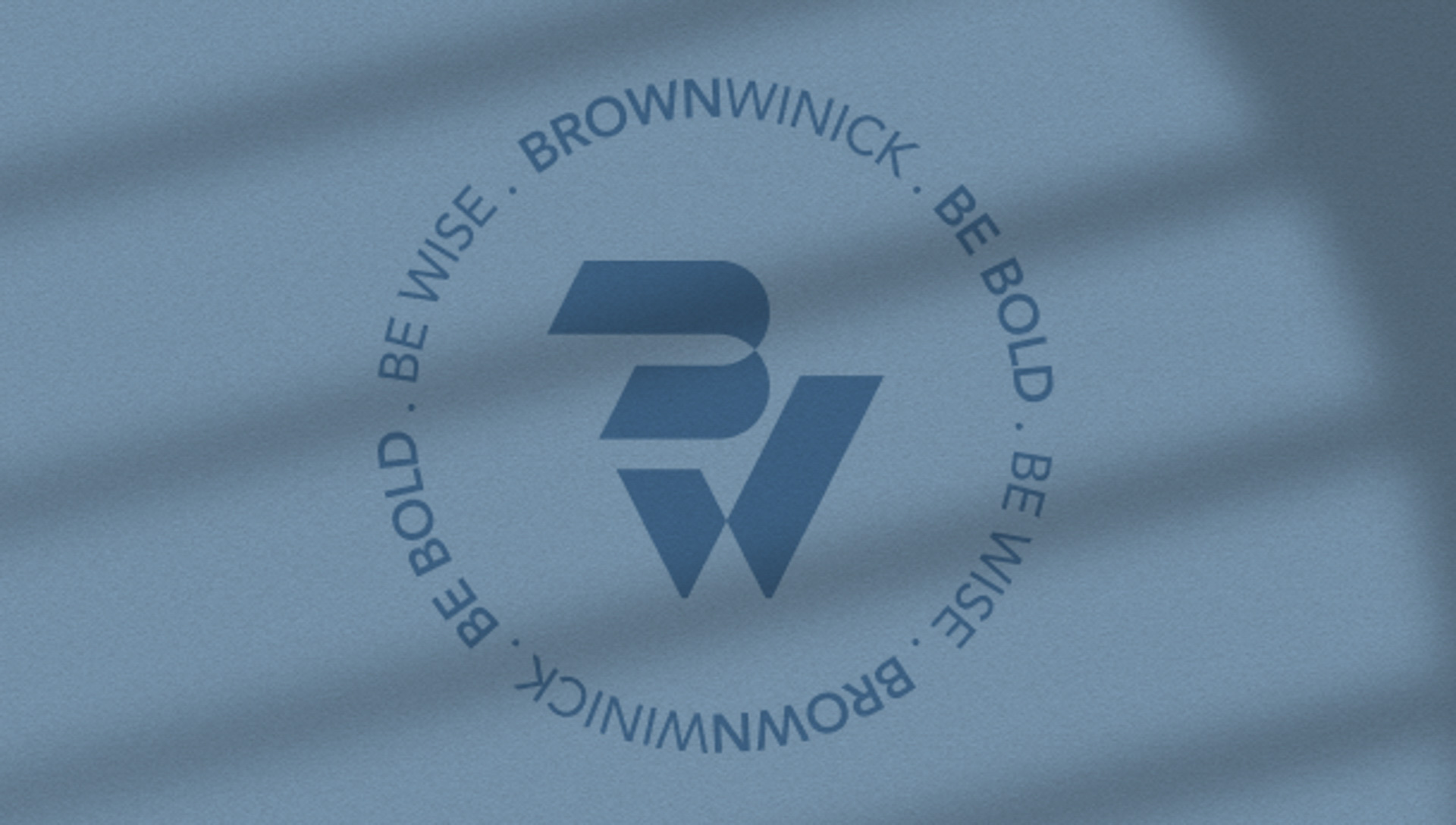
Strategic placement of the firm's signature "BE BOLD. BE WISE." tagline along side margins and envelope flaps reinforces the core brand message.
Standardized Letterhead Suite
Pre-formatted digital and print templates give the team an efficient way to maintain visual consistency across formal correspondence and everyday document generation.
DOCUMENT & PRESENTATION TEMPLATES
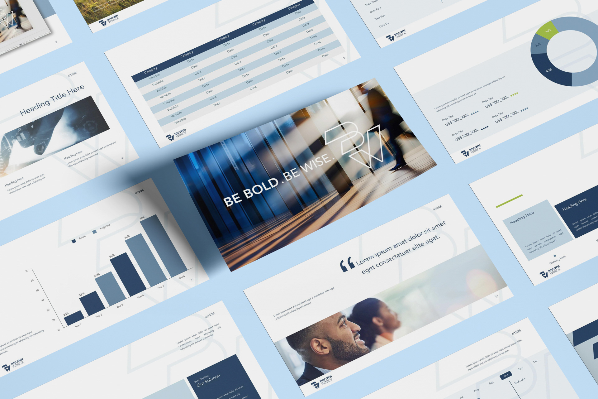
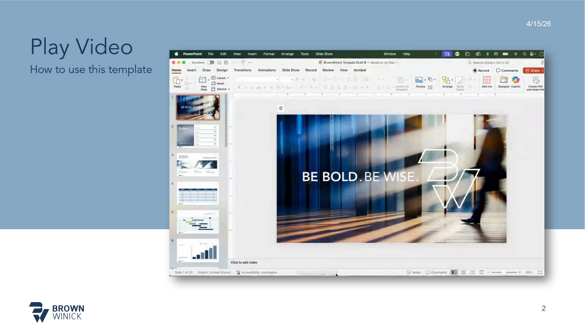
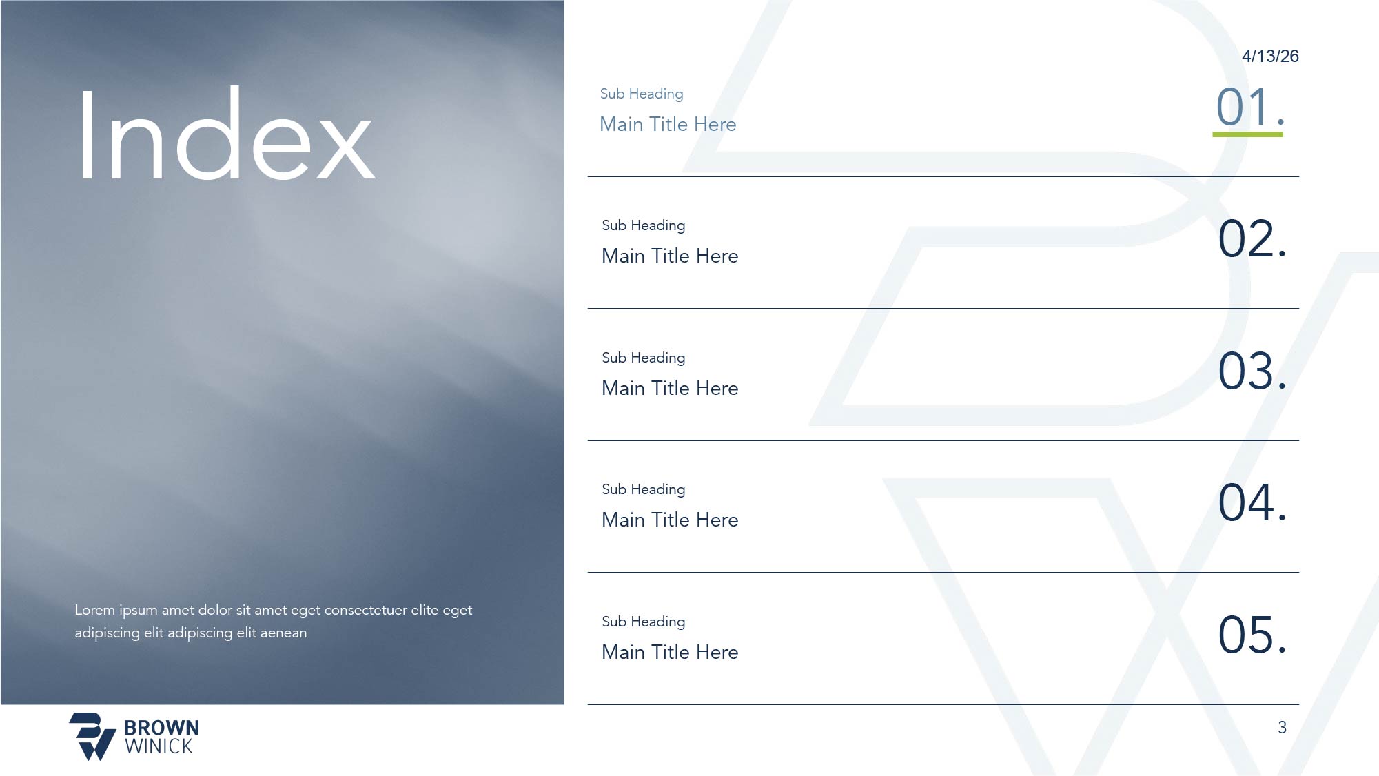
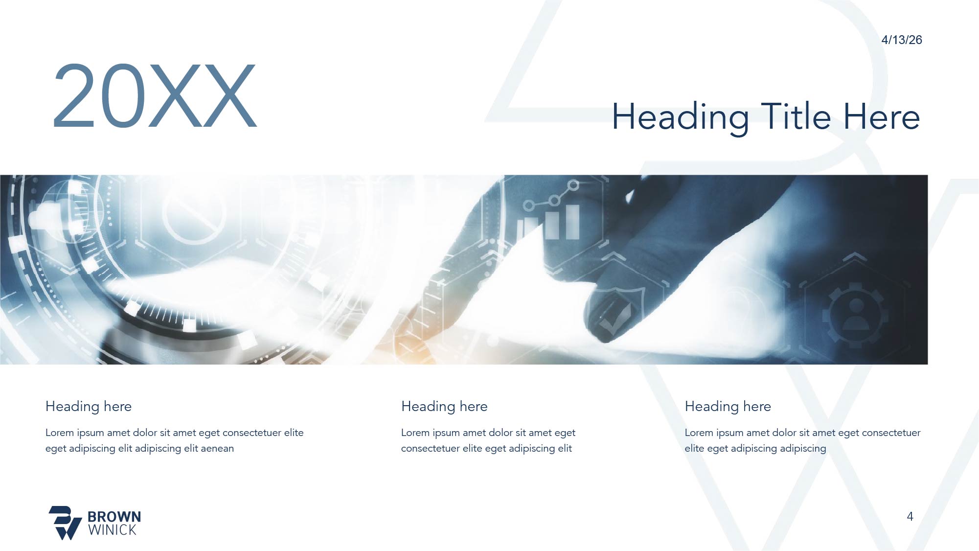
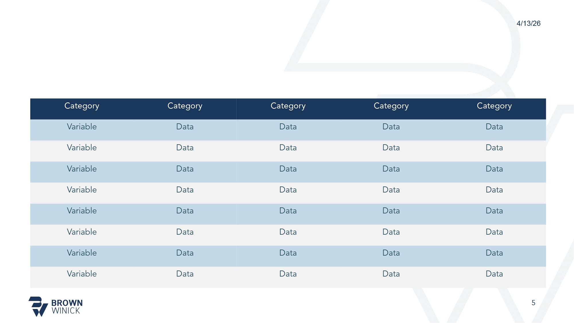
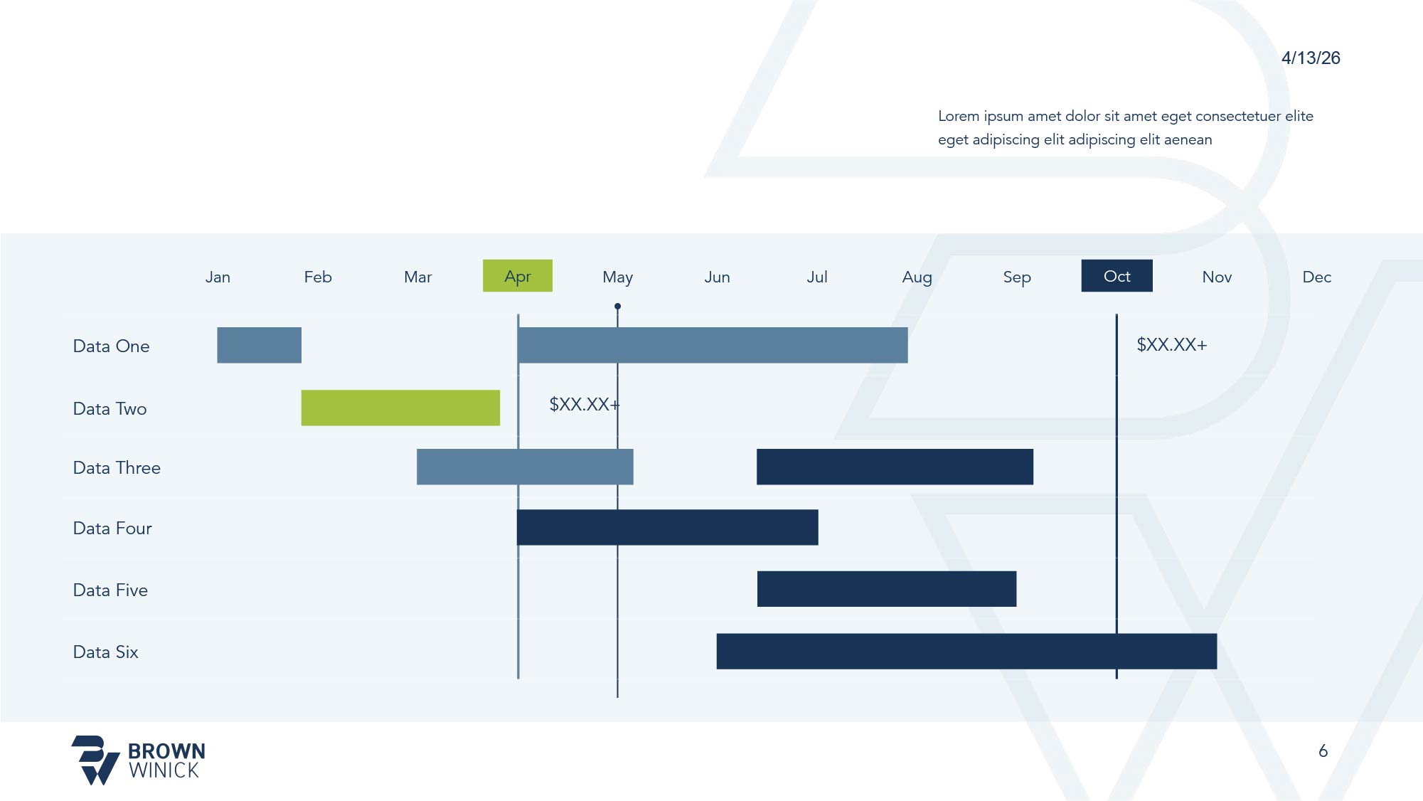
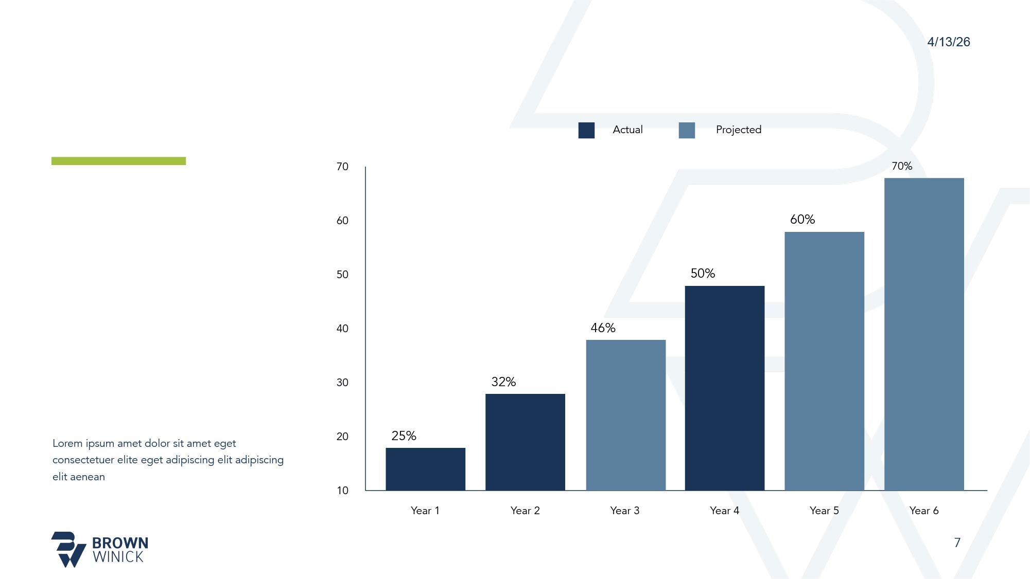
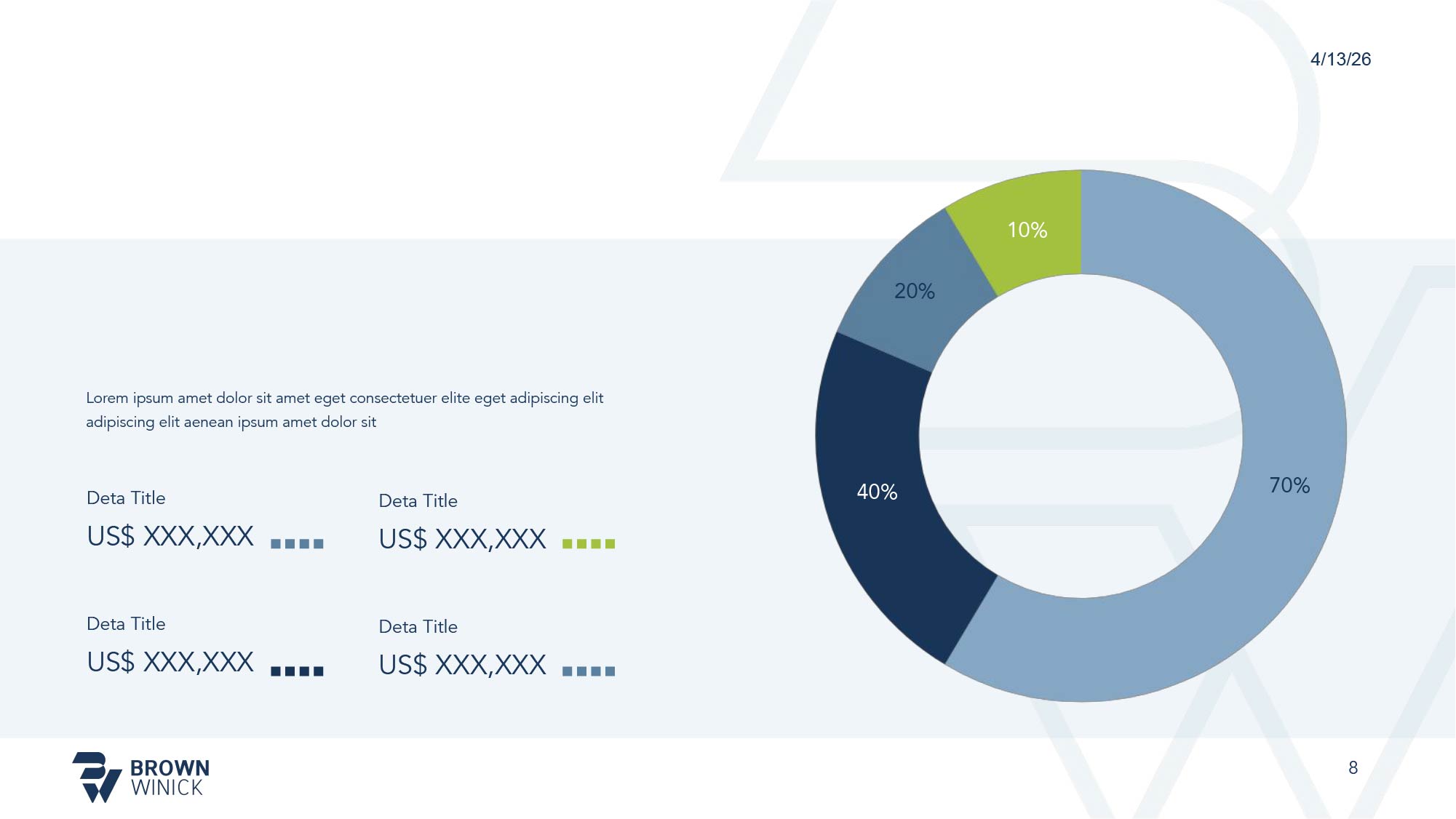
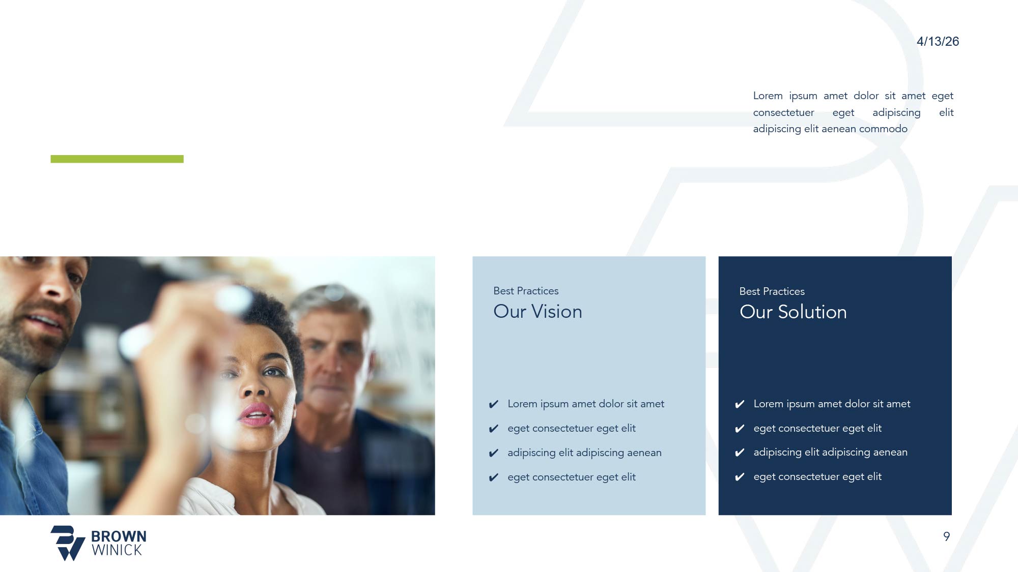
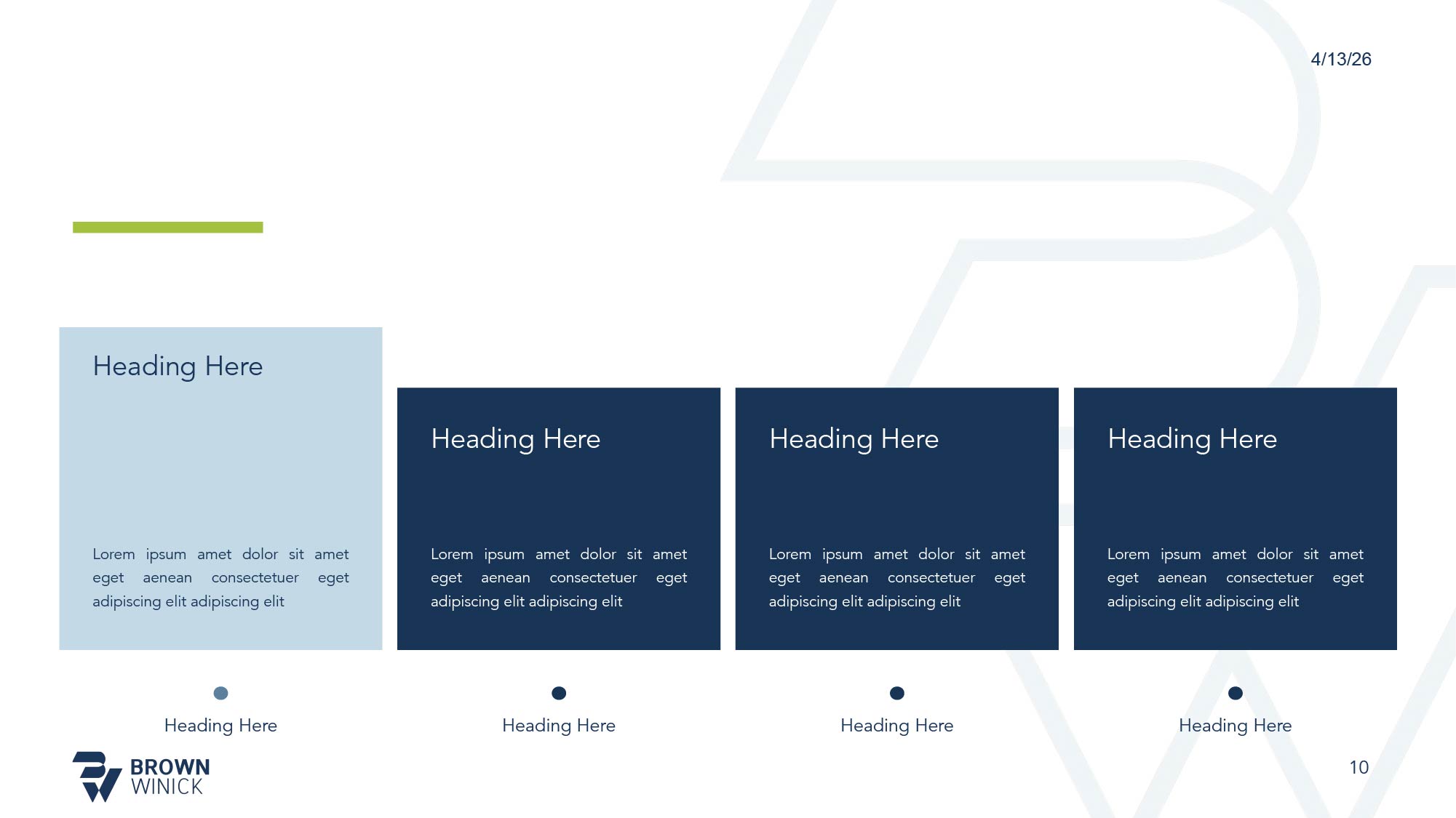
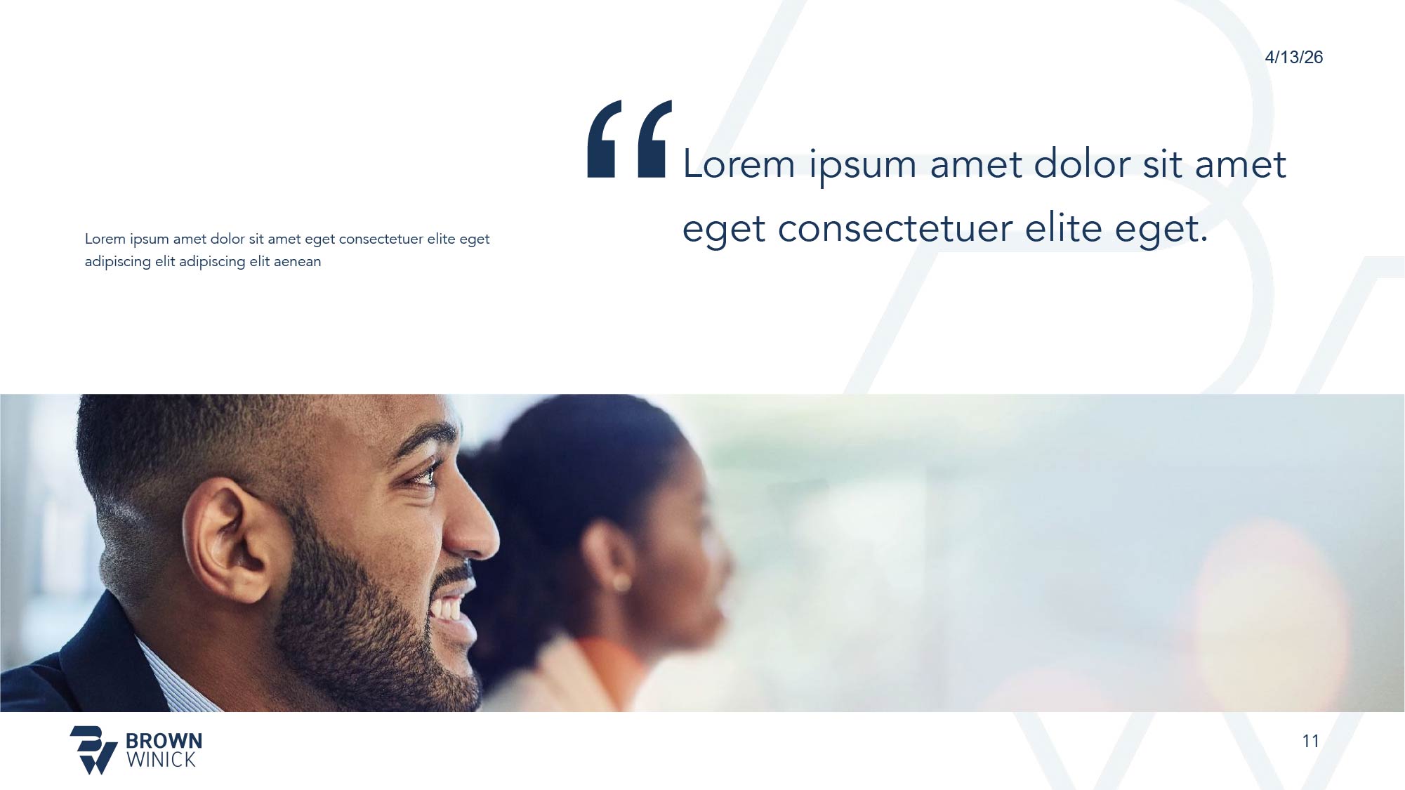
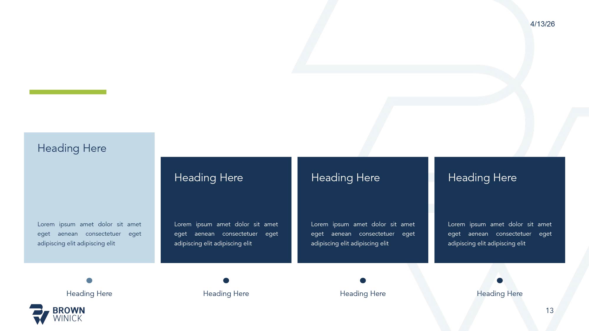
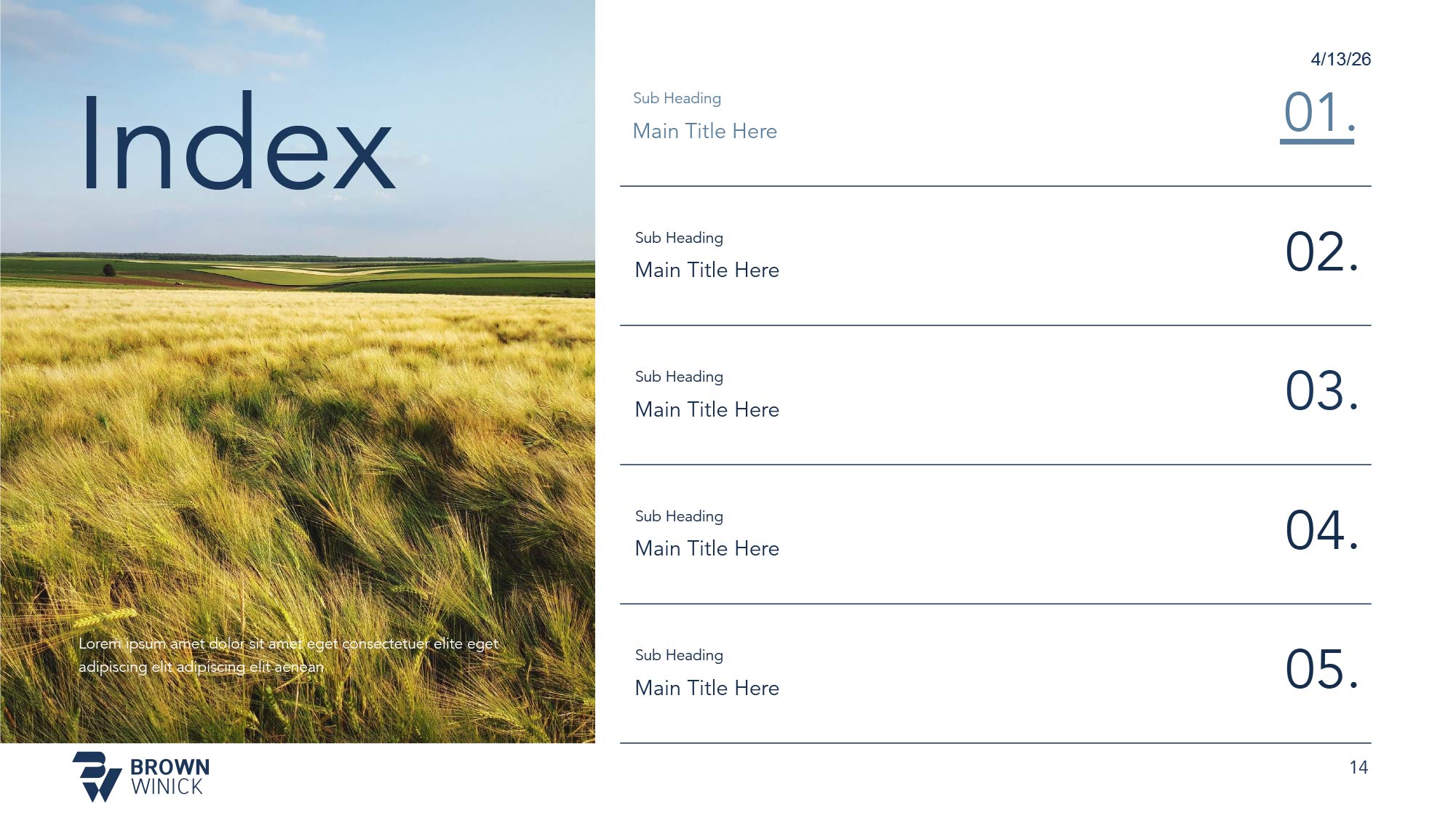
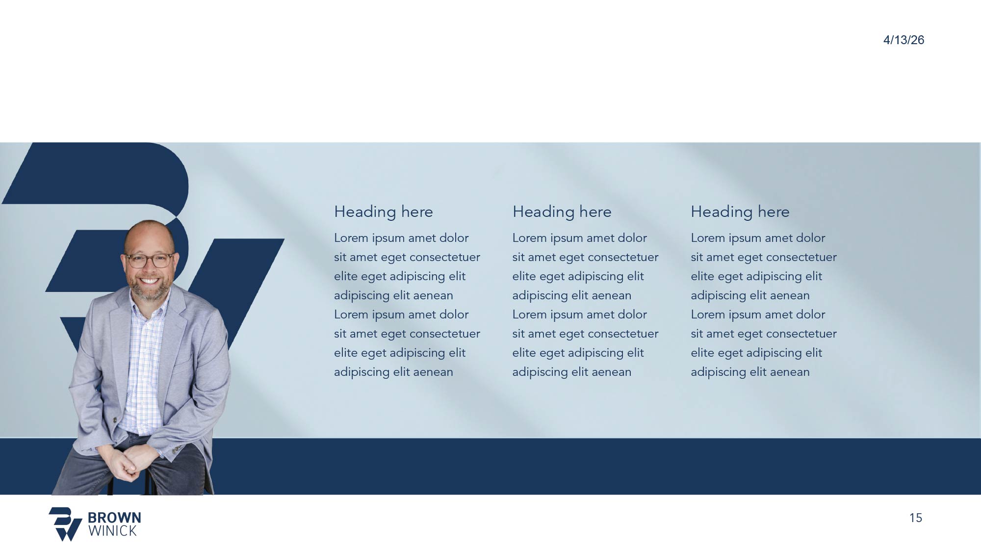
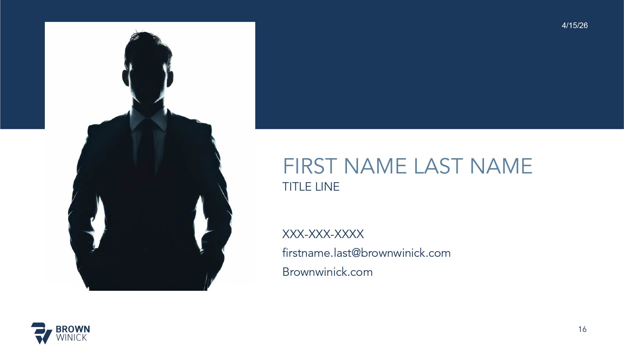
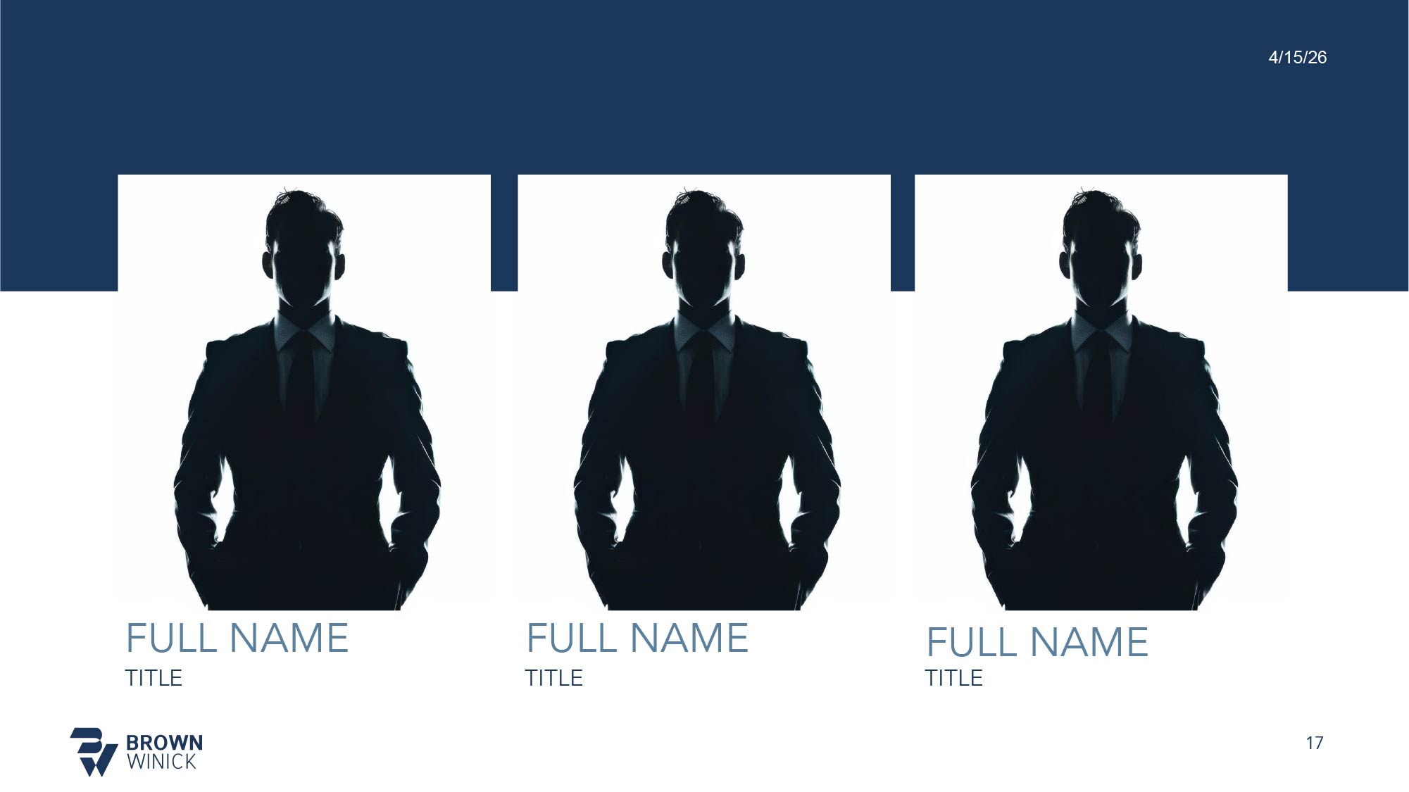
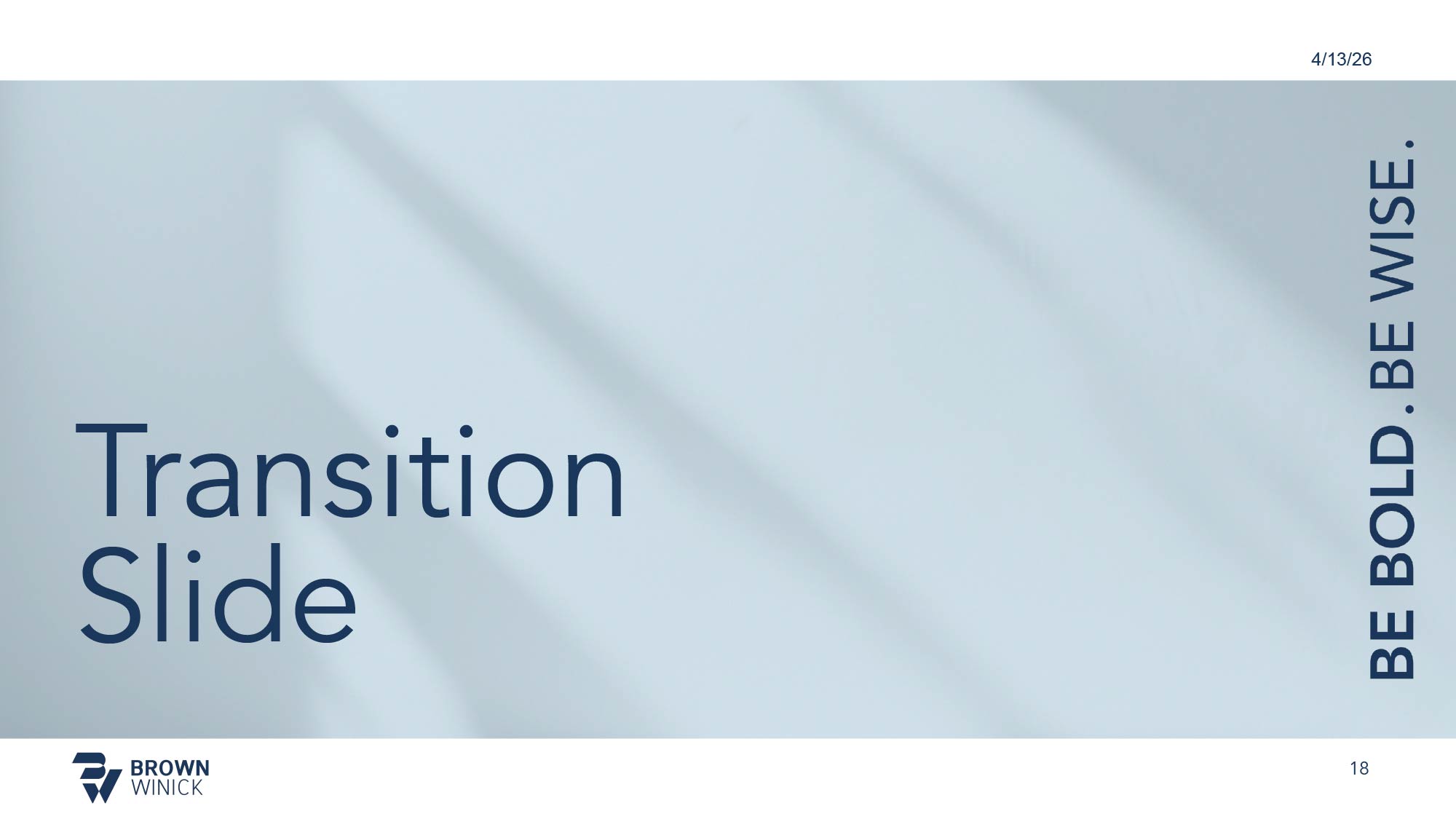
We created custom Microsoft Word and PowerPoint template suites specifically for the BrownWinick team. These assets help ensure pitch decks, legal proposals, and internal documents stay aligned with the brand, saving the team time while maintaining visual quality.
PowerPoint Master Slide System
Pre-built slide layouts, master slides, pre-formatted content blocks, and icon sets tailored for practice area pitches, client presentations, and firmwide meetings.
Formatted Word Documents
Standardized Word templates featuring pre-set typography hierarchies, custom headers, footers, and brand-compliant tables for legal briefs, proposals, and client reports.
Embedded Palette & Type
Templates engineered with built-in color palettes and typography styles across Microsoft 365, making it simple for staff to build clean decks and documents within brand guidelines.




EMAIL PRESENCE
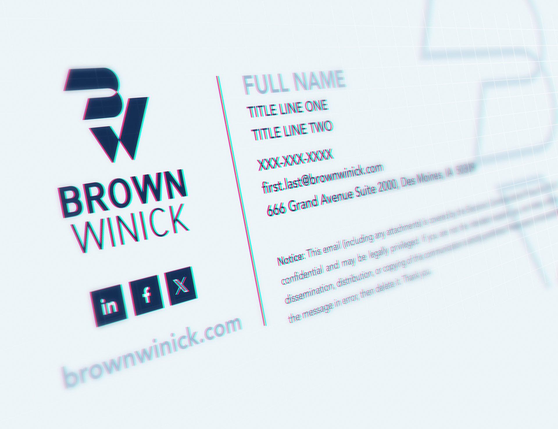
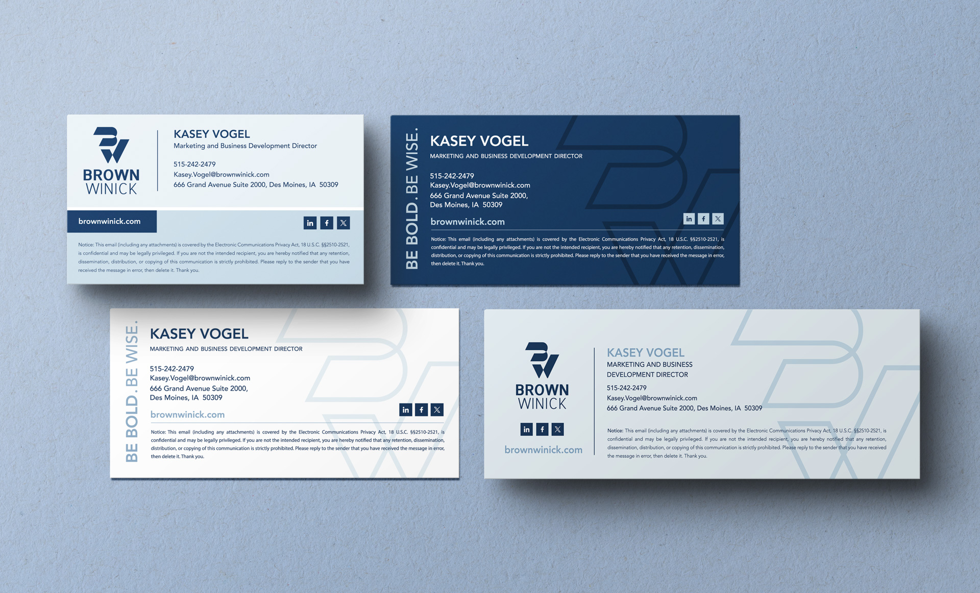
We extended BrownWinick's brand into everyday digital communication to build a clear sense of credibility and continuity. A clean, recognizable layout for contact details reinforces the firm's identity across digital touchpoints.
Email Signature System
Streamlined HTML and plain-text templates engineered to ensure clean contact formatting across desktop and mobile inboxes.
Profile Icon Assets
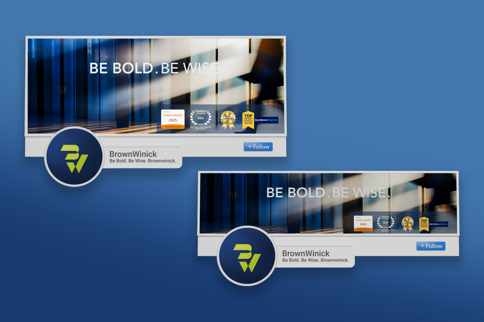
Standardized avatars and marks tailored specifically for messaging platforms, client portals, and web environments.
Unified Digital Touchpoints
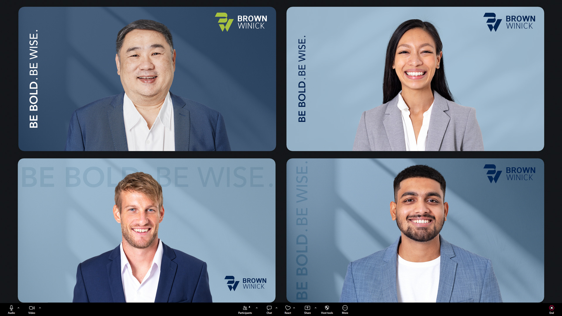
Coordinated virtual backgrounds, profile images, and shared materials to help maintain a recognizable presence across platforms.
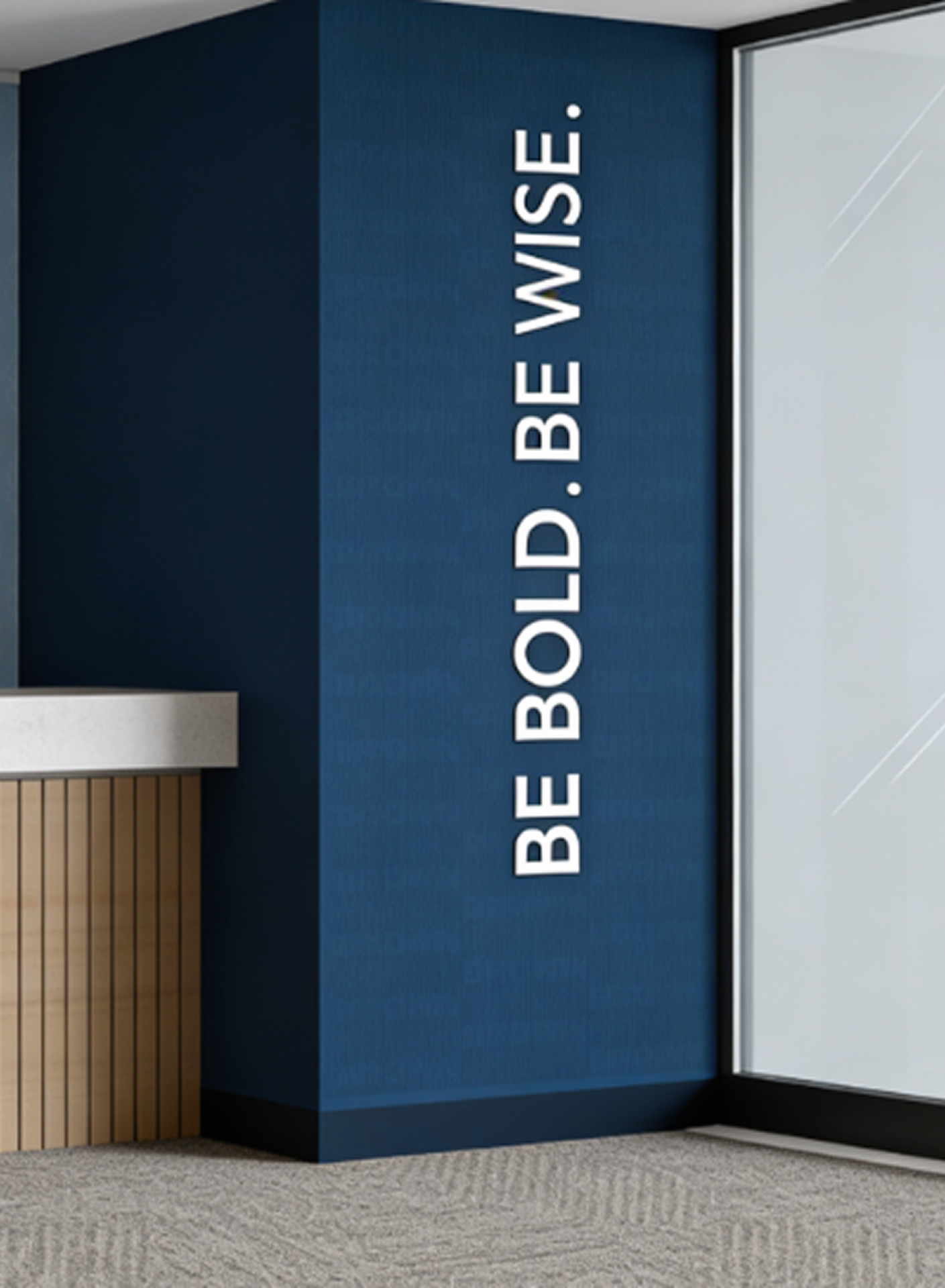
PHYSICAL SPACES & ENVIRONMENTAL BRANDING
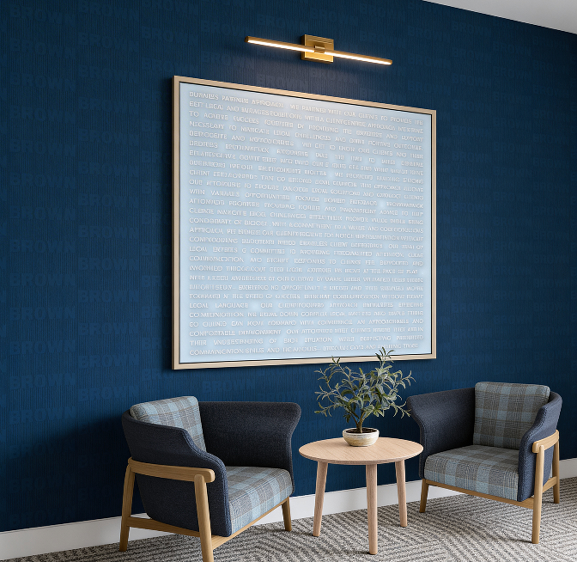
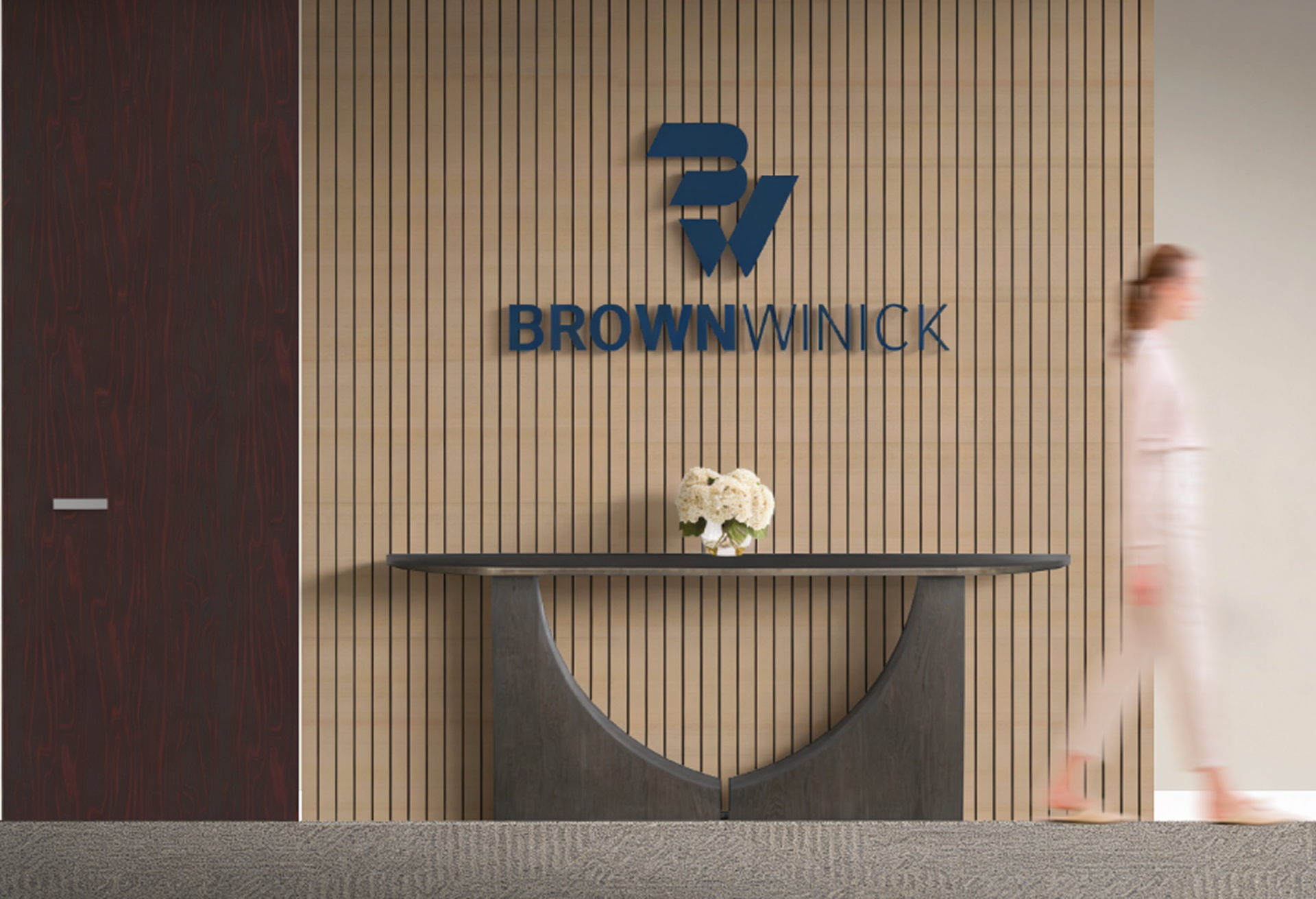
We translated the BrownWinick brand into the physical environment where the firm works and meets with clients. We established interior branding and environmental guidelines to shape how office spaces feel and function, bringing the visual identity into physical spaces with clarity and weight.
Materiality & Surface Finishes
We defined environmental standards for architectural surfaces, balancing natural wood tones, stone, polished metal, and textured wall coverings with the firm's core navy accent walls.
Wayfinding & Office Signage
We designed physical signage touchpoints, including dimensional lobby logo installations, frosted glass room dividers, and custom acrylic desk plaques featuring the subtle "BW" watermark motif.
Environmental Palette Application
We mapped the brand color palette to paint, upholstery, and architectural finishes, balancing light, scale, and material texture to preserve true color values throughout the office.
Strategic Partnership
Building a Scalable Brand System
We partnered closely with BrownWinick to establish an ongoing brand infrastructure that supports their team as they grow. Rather than delivering static assets, we built a living system engineered for seamless daily adoption across every department.
Operational Integration
We aligned pitch decks, executive letterheads, and business stationery into a unified workflow, making brand execution simple for the internal team.
Systemic Consistency
Custom textures, background patterns, and curated imagery guidelines were developed to maintain visual depth across digital platforms and physical spaces.
Long-Term Scalability
We established clear asset management and ordering structures, ensuring the brand identity remains cohesive as the firm expands.
.jpg)
Building a Complete, Actionable Brand System for BrownWinick
A Unified Visual Foundation
We anchored the brand with a professional navy palette, elevated the logo while honoring its original heritage, and built WCAG AA accessible color pairings for digital and print touchpoints.
Seamless Internal Execution
We equipped the team with custom Word and PowerPoint master templates, 220+ personalized employee business card layouts, and a corporate ordering portal featuring 16 dedicated print templates.
Cohesive Environmental Presence
We extended the identity into physical spaces, establishing clear guidelines for environmental signage, architectural materials, and custom pattern overlays that bring the brand to life in person.
By organizing BrownWinick’s visual identity into a practical, repeatable design system, we equipped the firm to execute marketing, client communications, and interior branding with confidence. This ensures their interactions reflect their core promise: Be bold and be wise.